Filters
Bootstrap 5 Filters plugin
Filters are the best way to select data that meets your requirements - they affect your search results by filtrating and sorting the dataset you pass to our component.
Note: Read the API tab to find all available options and advanced customization
Basic example - DOM Elements
Use the data-mdb-items attribute to define a container with data to filter. This
is required for proper component initialization.
Add data-mdb-filter="property" to every item you want to be filtrable. If you
want to handle your filters by inputs, make a container for them, and add
data-mdb-filter="property" to it.
Note: You must have at least one filtrable element for a component to work properly.
Checkbox example
Note: If there is more than one option, the result of filtering will show items that match both of them.
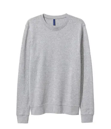
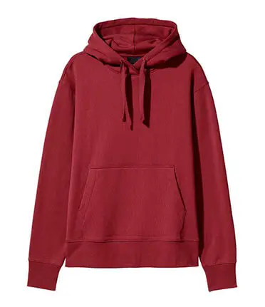
Color example
Filter: Color
Size example
Animations with DOM Elements
Add .animation and .animation-name classes to filtrable elements to
animate them. The full list of available animations you can find
here.
Data structure - array
Note: Your data-mdb-items set can be an array of items. We made
this solution for backend needs. Just set your dataset using a constructor.
Spinner & Asynchronous Data example
Price:
Animations - Array of Items
Add .animation and .animation-name classes to rendered elements to
animate them. The full list of available animations you can find
here.
Filter and sort
Customization - custom filter
Pass an arrow function as the value of the filter key at the filter object to define your custom filter.
Price:
Current: 80$
Current: 120$
Custom sort
Pass an arrow function (with two parameters - previous and second comparing items) as the third parameter at the sort function to define your custom sort rule.
Full screen example
Filters - API
Usage
Via data attributes
      <div id="myFilters" data-mdb-auto-filter="true" data-mdb-items=".filters-item">
        <div id="inputsGroup">
          <div data-mdb-filter="color">
            <div class="form-check mt-3">
              <input class="form-check-input" type="checkbox" id="inlineCheckbox1" value="red" />
              <label class="form-check-label" for="inlineCheckbox1">Red</label>
            </div>

            <div class="form-check">
              <input class="form-check-input" type="checkbox" id="inlineCheckbox2" value="blue" />
              <label class="form-check-label" for="inlineCheckbox2">Blue</label>
            </div>

            <div class="form-check">
              <input class="form-check-input" type="checkbox" id="inlineCheckbox3" value="black" />
              <label class="form-check-label" for="inlineCheckbox3">Black</label>
            </div>

            <div class="form-check">
              <input class="form-check-input" type="checkbox" id="inlineCheckbox4" value="gray" />
              <label class="form-check-label" for="inlineCheckbox4">Gray</label>
            </div>
          </div>

          <div data-mdb-filter="sale">
            <div class="form-check">
              <input class="form-check-input" type="checkbox" id="inlineCheckbox5" value="yes" />
              <label class="form-check-label" for="inlineCheckbox3">No</label>
            </div>

            <div class="form-check">
              <input class="form-check-input" type="checkbox" id="inlineCheckbox6" value="no" />
              <label class="form-check-label" for="inlineCheckbox4">No</label>
            </div>
          </div>
        </div>

        <div class="filters-item" data-mdb-color="blue" data-mdb-sale="no">
          <span>Color: blue, Sale: No</span>
        </div>
        <div class="filters-item" data-mdb-color="red" data-mdb-sale="yes">
          <span>Color: red, Sale: No</span>
        </div>
        <div class="filters-item" data-mdb-color="red" data-mdb-sale="no">
          <span>Color: red, Sale: yes</span>
        </div>
        <div class="filters-item" data-mdb-color="yellow" data-mdb-sale="yes">
          <span>Color: yellow, Sale: yes</span>
        </div>
      </div>
Via JavaScript
const filtersInstance = new Filters(document.getElementById('myFilters'), options)
Via jQuery
Note: By default, MDB does not include jQuery and you have to add it to the project on your own.
$('.example-class').filters(options);
Options
| Name | Type | Default | Description |
|---|---|---|---|
data-mdb-items
|
String | - |
Sets a selector for filtering items. |
data-mdb-property
|
String | - |
Defines a filter value for an item. Swap property with a filter name that
your items should have.
|
data-mdb-filter
|
String | - |
Sets a filter handler to the input group that it is applied to. |
data-mdb-auto-filter
|
String | false |
Applied to an instance enables auto filtering by inputs. |
Methods
| Name | Description | Example |
|---|---|---|
dispose
|
Destroys an Filters instance |
filtersInstance.dispose()
|
filter |
Filters an instance dataset |
filtersInstance.filter(options)
|
getFilters
|
Returns all available filters |
filtersInstance.getFilters()
|
getActiveFilters
|
Returns all active filters |
filtersInstance.getActiveFilters()
|
getInstance
|
Static method which allows you to get the filters instance associated to a DOM element. |
Filters.getInstance(filtersElement)
|
clear |
Clears all filters |
filtersInstance.clear()
|
sort |
Sorts an instance dataset |
filtersInstance.sort(category, order, additionalCustomSort)
|
      const filtersElement = document.getElementById('filtersElement');
      const filtersInstance = new Filters(filtersElement);

      filtersInstance.filter({
        color: ['red', 'blue'],
        sale: ['no']
      });
Events
| Name | Description |
|---|---|
update.mdb.filters
|
This event fires immediately when the instance filters or sort its dataset. |
      const filtersElement = document.getElementById('filtersElement');

      filtersElement.addEventListener('update.mdb.filters', function (e) {
        // do something...
      });
Import
MDB UI KIT also works with module bundlers. Use the following code to import this component:
import Filters from 'mdb-filters';


