Gallery
Bootstrap Gallery - examples & tutorial
A stunning collection of responsive galleries created with the latest Bootstrap 5. Image gallery, video gallery, photo gallery, full-page, eCommerce, lightbox, slider, thumbnails, and many more.
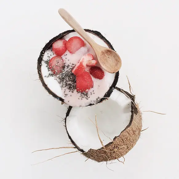
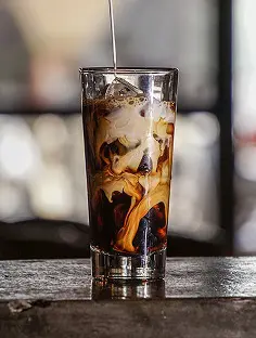
Static images
An example with the usage of static images.
To learn more read Images Docs.
.webp)


.webp)

          <!-- Gallery -->
          <div class="row">
            <div class="col-lg-4 col-md-12 mb-4 mb-lg-0">
              <img
                src="https://mdbootstrap.com/img/Photos/Horizontal/Nature/4-col/img%20(73).webp"
                class="w-100 shadow-1-strong rounded mb-4"
                alt=""
              />

              <img
                src="https://mdbootstrap.com/img/Photos/Vertical/mountain1.webp"
                class="w-100 shadow-1-strong rounded mb-4"
                alt=""
              />
            </div>

            <div class="col-lg-4 mb-4 mb-lg-0">
              <img
                src="https://mdbootstrap.com/img/Photos/Vertical/mountain2.webp"
                class="w-100 shadow-1-strong rounded mb-4"
                alt=""
              />

              <img
                src="https://mdbootstrap.com/img/Photos/Horizontal/Nature/4-col/img%20(73).webp"
                class="w-100 shadow-1-strong rounded mb-4"
                alt=""
              />
            </div>

            <div class="col-lg-4 mb-4 mb-lg-0">
              <img
                src="https://mdbootstrap.com/img/Photos/Horizontal/Nature/4-col/img%20(18).webp"
                class="w-100 shadow-1-strong rounded mb-4"
                alt=""
              />

              <img
                src="https://mdbootstrap.com/img/Photos/Vertical/mountain3.webp"
                class="w-100 shadow-1-strong rounded mb-4"
                alt=""
              />
            </div>
          </div>
          <!-- Gallery -->
Carousel / Slider
Carousel (also called "slider") is a slideshow cycling through different elements such as photos, videos, or text.
To learn more read Carousel Docs.
.webp)
First slide label
Nulla vitae elit libero, a pharetra augue mollis interdum.
.webp)
Second slide label
Lorem ipsum dolor sit amet, consectetur adipiscing elit.
.webp)
Third slide label
Praesent commodo cursus magna, vel scelerisque nisl consectetur.
          <!-- Carousel wrapper -->
          <div
            id="carouselBasicExample"
            class="carousel slide carousel-fade"
            data-mdb-ride="carousel"
          >
            <!-- Indicators -->
            <div class="carousel-indicators">
              <button
                type="button"
                data-mdb-target="#carouselBasicExample"
                data-mdb-slide-to="0"
                class="active"
                aria-current="true"
                aria-label="Slide 1"
              ></button>
              <button
                type="button"
                data-mdb-target="#carouselBasicExample"
                data-mdb-slide-to="1"
                aria-label="Slide 2"
              ></button>
              <button
                type="button"
                data-mdb-target="#carouselBasicExample"
                data-mdb-slide-to="2"
                aria-label="Slide 3"
              ></button>
            </div>

            <!-- Inner -->
            <div class="carousel-inner">
              <!-- Single item -->
              <div class="carousel-item active">
                <img
                  src="https://mdbootstrap.com/img/Photos/Slides/img%20(15).webp"
                  class="d-block w-100"
                  alt="..."
                />
                <div class="carousel-caption d-none d-md-block">
                  <h5>First slide label</h5>
                  <p>
                    Nulla vitae elit libero, a pharetra augue mollis interdum.
                  </p>
                </div>
              </div>

              <!-- Single item -->
              <div class="carousel-item">
                <img
                  src="https://mdbootstrap.com/img/Photos/Slides/img%20(22).webp"
                  class="d-block w-100"
                  alt="..."
                />
                <div class="carousel-caption d-none d-md-block">
                  <h5>Second slide label</h5>
                  <p>
                    Lorem ipsum dolor sit amet, consectetur adipiscing elit.
                  </p>
                </div>
              </div>

              <!-- Single item -->
              <div class="carousel-item">
                <img
                  src="https://mdbootstrap.com/img/Photos/Slides/img%20(23).webp"
                  class="d-block w-100"
                  alt="..."
                />
                <div class="carousel-caption d-none d-md-block">
                  <h5>Third slide label</h5>
                  <p>
                    Praesent commodo cursus magna, vel scelerisque nisl consectetur.
                  </p>
                </div>
              </div>
            </div>
            <!-- Inner -->

            <!-- Controls -->
            <button
              class="carousel-control-prev"
              type="button"
              data-mdb-target="#carouselBasicExample"
              data-mdb-slide="prev"
            >
              <span class="carousel-control-prev-icon" aria-hidden="true"></span>
              <span class="visually-hidden">Previous</span>
            </button>
            <button
              class="carousel-control-next"
              type="button"
              data-mdb-target="#carouselBasicExample"
              data-mdb-slide="next"
            >
              <span class="carousel-control-next-icon" aria-hidden="true"></span>
              <span class="visually-hidden">Next</span>
            </button>
          </div>
          <!-- Carousel wrapper -->
Multi-item carousel
By using a combination of available classes you can create a carousel with multiple items on each slide.
If you need more advanced options and examples of multi-item carousel have a look at Multi-item Carousel Docs

Card title
Some quick example text to build on the card title and make up the bulk of the card's content.
Button
Card title
Some quick example text to build on the card title and make up the bulk of the card's content.
Button
Card title
Some quick example text to build on the card title and make up the bulk of the card's content.
Button
Card title
Some quick example text to build on the card title and make up the bulk of the card's content.
Button
Card title
Some quick example text to build on the card title and make up the bulk of the card's content.
Button
Card title
Some quick example text to build on the card title and make up the bulk of the card's content.
Button
Card title
Some quick example text to build on the card title and make up the bulk of the card's content.
Button
Card title
Some quick example text to build on the card title and make up the bulk of the card's content.
Button
Card title
Some quick example text to build on the card title and make up the bulk of the card's content.
Button
          <!-- Carousel wrapper -->
          <div
            id="carouselMultiItemExample"
            class="carousel slide carousel-dark text-center"
            data-mdb-ride="carousel"
          >
            <!-- Controls -->
            <div class="d-flex justify-content-center mb-4">
              <button
                class="carousel-control-prev position-relative"
                type="button"
                data-mdb-target="#carouselMultiItemExample"
                data-mdb-slide="prev"
              >
                <span class="carousel-control-prev-icon" aria-hidden="true"></span>
                <span class="visually-hidden">Previous</span>
              </button>
              <button
                class="carousel-control-next position-relative"
                type="button"
                data-mdb-target="#carouselMultiItemExample"
                data-mdb-slide="next"
              >
                <span class="carousel-control-next-icon" aria-hidden="true"></span>
                <span class="visually-hidden">Next</span>
              </button>
            </div>
            <!-- Inner -->
            <div class="carousel-inner py-4">
              <!-- Single item -->
              <div class="carousel-item active">
                <div class="container">
                  <div class="row">
                    <div class="col-lg-4">
                      <div class="card">
                        <img
                          src="https://mdbootstrap.com/img/new/standard/nature/181.webp"
                          class="card-img-top"
                          alt="..."
                        />
                        <div class="card-body">
                          <h5 class="card-title">Card title</h5>
                          <p class="card-text">
                            Some quick example text to build on the card title and make up the bulk
                            of the card's content.
                          </p>
                          <a href="#!" class="btn btn-primary">Button</a>
                        </div>
                      </div>
                    </div>

                    <div class="col-lg-4 d-none d-lg-block">
                      <div class="card">
                        <img
                          src="https://mdbootstrap.com/img/new/standard/nature/182.webp"
                          class="card-img-top"
                          alt="..."
                        />
                        <div class="card-body">
                          <h5 class="card-title">Card title</h5>
                          <p class="card-text">
                            Some quick example text to build on the card title and make up the bulk
                            of the card's content.
                          </p>
                          <a href="#!" class="btn btn-primary">Button</a>
                        </div>
                      </div>
                    </div>

                    <div class="col-lg-4 d-none d-lg-block">
                      <div class="card">
                        <img
                          src="https://mdbootstrap.com/img/new/standard/nature/183.webp"
                          class="card-img-top"
                          alt="..."
                        />
                        <div class="card-body">
                          <h5 class="card-title">Card title</h5>
                          <p class="card-text">
                            Some quick example text to build on the card title and make up the bulk
                            of the card's content.
                          </p>
                          <a href="#!" class="btn btn-primary">Button</a>
                        </div>
                      </div>
                    </div>
                  </div>
                </div>
              </div>

              <!-- Single item -->
              <div class="carousel-item">
                <div class="container">
                  <div class="row">
                    <div class="col-lg-4 col-md-12">
                      <div class="card">
                        <img
                          src="https://mdbootstrap.com/img/new/standard/nature/184.webp"
                          class="card-img-top"
                          alt="..."
                        />
                        <div class="card-body">
                          <h5 class="card-title">Card title</h5>
                          <p class="card-text">
                            Some quick example text to build on the card title and make up the bulk
                            of the card's content.
                          </p>
                          <a href="#!" class="btn btn-primary">Button</a>
                        </div>
                      </div>
                    </div>

                    <div class="col-lg-4 d-none d-lg-block">
                      <div class="card">
                        <img
                          src="https://mdbootstrap.com/img/new/standard/nature/185.webp"
                          class="card-img-top"
                          alt="..."
                        />
                        <div class="card-body">
                          <h5 class="card-title">Card title</h5>
                          <p class="card-text">
                            Some quick example text to build on the card title and make up the bulk
                            of the card's content.
                          </p>
                          <a href="#!" class="btn btn-primary">Button</a>
                        </div>
                      </div>
                    </div>

                    <div class="col-lg-4 d-none d-lg-block">
                      <div class="card">
                        <img
                          src="https://mdbootstrap.com/img/new/standard/nature/186.webp"
                          class="card-img-top"
                          alt="..."
                        />
                        <div class="card-body">
                          <h5 class="card-title">Card title</h5>
                          <p class="card-text">
                            Some quick example text to build on the card title and make up the bulk
                            of the card's content.
                          </p>
                          <a href="#!" class="btn btn-primary">Button</a>
                        </div>
                      </div>
                    </div>
                  </div>
                </div>
              </div>

              <!-- Single item -->
              <div class="carousel-item">
                <div class="container">
                  <div class="row">
                    <div class="col-lg-4 col-md-12 mb-4 mb-lg-0">
                      <div class="card">
                        <img
                          src="https://mdbootstrap.com/img/new/standard/nature/187.webp"
                          class="card-img-top"
                          alt="..."
                        />
                        <div class="card-body">
                          <h5 class="card-title">Card title</h5>
                          <p class="card-text">
                            Some quick example text to build on the card title and make up the bulk
                            of the card's content.
                          </p>
                          <a href="#!" class="btn btn-primary">Button</a>
                        </div>
                      </div>
                    </div>

                    <div class="col-lg-4 mb-4 mb-lg-0 d-none d-lg-block">
                      <div class="card">
                        <img
                          src="https://mdbootstrap.com/img/new/standard/nature/188.webp"
                          class="card-img-top"
                          alt="..."
                        />
                        <div class="card-body">
                          <h5 class="card-title">Card title</h5>
                          <p class="card-text">
                            Some quick example text to build on the card title and make up the bulk
                            of the card's content.
                          </p>
                          <a href="#!" class="btn btn-primary">Button</a>
                        </div>
                      </div>
                    </div>

                    <div class="col-lg-4 mb-4 mb-lg-0 d-none d-lg-block">
                      <div class="card">
                        <img
                          src="https://mdbootstrap.com/img/new/standard/nature/189.webp"
                          class="card-img-top"
                          alt="..."
                        />
                        <div class="card-body">
                          <h5 class="card-title">Card title</h5>
                          <p class="card-text">
                            Some quick example text to build on the card title and make up the bulk
                            of the card's content.
                          </p>
                          <a href="#!" class="btn btn-primary">Button</a>
                        </div>
                      </div>
                    </div>
                  </div>
                </div>
              </div>
            </div>
            <!-- Inner -->
          </div>
          <!-- Carousel wrapper -->
Video carousel
Instead of images, you can also use videos.
          <!-- Carousel wrapper -->
          <div
            id="carouselVideoExample"
            class="carousel slide carousel-fade"
            data-mdb-ride="carousel"
          >
            <!-- Indicators -->
            <div class="carousel-indicators">
              <button
                type="button"
                data-mdb-target="#carouselVideoExample"
                data-mdb-slide-to="0"
                class="active"
                aria-current="true"
                aria-label="Slide 1"
              ></button>
              <button
                type="button"
                data-mdb-target="#carouselVideoExample"
                data-mdb-slide-to="1"
                aria-label="Slide 2"
              ></button>
              <button
                type="button"
                data-mdb-target="#carouselVideoExample"
                data-mdb-slide-to="2"
                aria-label="Slide 3"
              ></button>
            </div>

            <!-- Inner -->
            <div class="carousel-inner">
              <!-- Single item -->
              <div class="carousel-item active">
                <video class="img-fluid" autoplay loop muted>
                  <source src="https://mdbootstrap.com/img/video/Tropical.mp4" type="video/mp4" />
                </video>
                <div class="carousel-caption d-none d-md-block">
                  <h5>First slide label</h5>
                  <p>
                    Nulla vitae elit libero, a pharetra augue mollis interdum.
                  </p>
                </div>
              </div>

              <!-- Single item -->
              <div class="carousel-item">
                <video class="img-fluid" autoplay loop muted>
                  <source src="https://mdbootstrap.com/img/video/forest.mp4" type="video/mp4" />
                </video>
                <div class="carousel-caption d-none d-md-block">
                  <h5>Second slide label</h5>
                  <p>
                    Lorem ipsum dolor sit amet, consectetur adipiscing elit.
                  </p>
                </div>
              </div>

              <!-- Single item -->
              <div class="carousel-item">
                <video class="img-fluid" autoplay loop muted>
                  <source
                    src="https://mdbootstrap.com/img/video/Agua-natural.mp4"
                    type="video/mp4"
                  />
                </video>
                <div class="carousel-caption d-none d-md-block">
                  <h5>Third slide label</h5>
                  <p>
                    Praesent commodo cursus magna, vel scelerisque nisl consectetur.
                  </p>
                </div>
              </div>
            </div>
            <!-- Inner -->

            <!-- Controls -->
            <button
              class="carousel-control-prev"
              type="button"
              data-mdb-target="#carouselVideoExample"
              data-mdb-slide="prev"
            >
              <span class="carousel-control-prev-icon" aria-hidden="true"></span>
              <span class="visually-hidden">Previous</span>
            </button>
            <button
              class="carousel-control-next"
              type="button"
              data-mdb-target="#carouselVideoExample"
              data-mdb-slide="next"
            >
              <span class="carousel-control-next-icon" aria-hidden="true"></span>
              <span class="visually-hidden">Next</span>
            </button>
          </div>
          <!-- Carousel wrapper -->
Gallery with modals and YouTube videos
An example of the combination of bootstrap modals and youtube video embeds.
To learn more read Modals Docs and Embeds Docs.


          <!-- Modal gallery -->
          <section class="">
            <!-- Section: Images -->
            <section class="">
              <div class="row">
                <div class="col-lg-4 col-md-12 mb-4 mb-lg-0">
                  <div
                    class="bg-image hover-overlay ripple shadow-1-strong rounded"
                    data-ripple-color="light"
                  >
                    <img
                      src="https://mdbootstrap.com/img/screens/yt/screen-video-1.webp"
                      class="w-100"
                    />
                    <a href="#!" data-mdb-toggle="modal" data-mdb-target="#exampleModal1">
                      <div class="mask" style="background-color: rgba(251, 251, 251, 0.2);"></div>
                    </a>
                  </div>
                </div>

                <div class="col-lg-4 mb-4 mb-lg-0">
                  <div
                    class="bg-image hover-overlay ripple shadow-1-strong rounded"
                    data-ripple-color="light"
                  >
                    <img
                      src="https://mdbootstrap.com/img/screens/yt/screen-video-2.webp"
                      class="w-100"
                    />
                    <a href="#!" data-mdb-toggle="modal" data-mdb-target="#exampleModal2">
                      <div class="mask" style="background-color: rgba(251, 251, 251, 0.2);"></div>
                    </a>
                  </div>
                </div>

                <div class="col-lg-4 mb-4 mb-lg-0">
                  <div
                    class="bg-image hover-overlay ripple shadow-1-strong rounded"
                    data-ripple-color="light"
                  >
                    <img
                      src="https://mdbootstrap.com/img/screens/yt/screen-video-3.webp"
                      class="w-100"
                    />
                    <a href="#!" data-mdb-toggle="modal" data-mdb-target="#exampleModal3">
                      <div class="mask" style="background-color: rgba(251, 251, 251, 0.2);"></div>
                    </a>
                  </div>
                </div>
              </div>
            </section>
            <!-- Section: Images -->

            <!-- Section: Modals -->
            <section class="">
              <!-- Modal 1 -->
              <div
                class="modal fade"
                id="exampleModal1"
                tabindex="-1"
                aria-labelledby="exampleModal1Label"
                aria-hidden="true"
              >
                <div class="modal-dialog modal-lg">
                  <div class="modal-content">
                    <div class="ratio ratio-16x9">
                      <iframe
                        src="https://www.youtube.com/embed/A3PDXmYoF5U"
                        title="YouTube video"
                        allowfullscreen
                      ></iframe>
                    </div>

                    <div class="text-center py-3">
                      <button type="button" class="btn btn-secondary" data-mdb-dismiss="modal">
                        Close
                      </button>
                    </div>
                  </div>
                </div>
              </div>
              <!-- Modal 2 -->
              <div
                class="modal fade"
                id="exampleModal2"
                tabindex="-1"
                aria-labelledby="exampleModal2Label"
                aria-hidden="true"
              >
                <div class="modal-dialog modal-lg">
                  <div class="modal-content">
                    <div class="ratio ratio-16x9">
                      <iframe
                        src="https://www.youtube.com/embed/wTcNtgA6gHs"
                        title="YouTube video"
                        allowfullscreen
                      ></iframe>
                    </div>

                    <div class="text-center py-3">
                      <button type="button" class="btn btn-secondary" data-mdb-dismiss="modal">
                        Close
                      </button>
                    </div>
                  </div>
                </div>
              </div>
              <!-- Modal 3 -->
              <div
                class="modal fade"
                id="exampleModal3"
                tabindex="-1"
                aria-labelledby="exampleModal3Label"
                aria-hidden="true"
              >
                <div class="modal-dialog modal-lg">
                  <div class="modal-content">
                    <div class="ratio ratio-16x9">
                      <iframe
                        src="https://www.youtube.com/embed/vlDzYIIOYmM"
                        title="YouTube video"
                        allowfullscreen
                      ></iframe>
                    </div>

                    <div class="text-center py-3">
                      <button type="button" class="btn btn-secondary" data-mdb-dismiss="modal">
                        Close
                      </button>
                    </div>
                  </div>
                </div>
              </div>
            </section>
            <!-- Section: Modals -->
          </section>
          <!-- Modal gallery -->
Lightbox
If you need advanced options you can use MDBootstrap LightBox component.
Note: This component requires MDBootstrap Pro package.

          <div class="lightbox">
            <div class="row">
              <div class="col-lg-6">
                <img
                  src="https://mdbootstrap.com/img/Photos/Thumbnails/Slides/1.webp"
                  data-mdb-img="https://mdbootstrap.com/img/Photos/Slides/1.webp"
                  alt="Lightbox image 1"
                  class="w-100 mb-2 mb-md-4 shadow-1-strong rounded"
                />
                <img
                  src="https://mdbootstrap.com/img/Photos/Thumbnails/Square/1.webp"
                  data-mdb-img="https://mdbootstrap.com/img/Photos/Square/1.webp"
                  alt="Lightbox image 2"
                  class="w-100 shadow-1-strong rounded"
                />
              </div>
              <div class="col-lg-6">
                <img
                  src="https://mdbootstrap.com/img/Photos/Thumbnails/Vertical/1.webp"
                  data-mdb-img="https://mdbootstrap.com/img/Photos/Vertical/1.webp"
                  alt="Lightbox image 3"
                  class="w-100 shadow-1-strong rounded"
                />
              </div>
            </div>
          </div>
Advanced multi-item carousel
If you need advanced multi-item gallery you can use MDBootstrap Multi Item component.
Note: This component requires MDBootstrap Pro package.


          <div class="lightbox">
            <div class="multi-carousel">
              <div class="multi-carousel-inner">
                <div class="multi-carousel-item">
                  <img
                    src="https://mdbootstrap.com/img/Photos/Thumbnails/Slides/1.webp"
                    data-mdb-img="https://mdbootstrap.com/img/Photos/Slides/1.webp"
                    alt="Gallery image 1"
                    class="w-100"
                  />
                </div>
                <div class="multi-carousel-item">
                  <img
                    src="https://mdbootstrap.com/img/Photos/Thumbnails/Slides/2.webp"
                    data-mdb-img="https://mdbootstrap.com/img/Photos/Slides/2.webp"
                    alt="Gallery image 2"
                    class="w-100"
                  />
                </div>
                <div class="multi-carousel-item">
                  <img
                    src="https://mdbootstrap.com/img/Photos/Thumbnails/Slides/3.webp"
                    data-mdb-img="https://mdbootstrap.com/img/Photos/Slides/3.webp"
                    alt="Gallery image 3"
                    class="w-100"
                  />
                </div>
                <div class="multi-carousel-item">
                  <img
                    src="https://mdbootstrap.com/img/Photos/Thumbnails/Slides/4.webp"
                    data-mdb-img="https://mdbootstrap.com/img/Photos/Slides/4.webp"
                    alt="Gallery image 4"
                    class="w-100"
                  />
                </div>
              </div>
              <button
                class="carousel-control-prev"
                type="button"
                tabindex="0"
                data-mdb-slide="prev"
              >
                <span class="carousel-control-prev-icon" aria-hidden="true"></span>
              </button>
              <button
                class="carousel-control-next"
                type="button"
                tabindex="0"
                data-mdb-slide="next"
              >
                <span class="carousel-control-next-icon" aria-hidden="true"></span>
              </button>
            </div>
          </div>
Vertical multi item carousel
Vertical implementation of Multi Item carousel.
Note: This component requires MDBootstrap Pro package.
          <div class="multi-carousel vertical" style="max-width: 20rem;">
            <div class="multi-carousel-inner">
              <div class="multi-carousel-item">
                <img
                  src="https://mdbootstrap.com/img/Photos/Thumbnails/Slides/1.webp"
                  alt="Gallery image 1"
                  class="w-100"
                />
              </div>
              <div class="multi-carousel-item">
                <img
                  src="https://mdbootstrap.com/img/Photos/Thumbnails/Slides/2.webp"
                  alt="Gallery image 2"
                  class="w-100"
                />
              </div>
              <div class="multi-carousel-item">
                <img
                  src="https://mdbootstrap.com/img/Photos/Thumbnails/Slides/3.webp"
                  alt="Gallery image 3"
                  class="w-100"
                />
              </div>
              <div class="multi-carousel-item">
                <img
                  src="https://mdbootstrap.com/img/Photos/Thumbnails/Slides/4.webp"
                  alt="Gallery image 4"
                  class="w-100"
                />
              </div>
            </div>
            <button class="carousel-control-prev" type="button" tabindex="0" data-mdb-slide="prev">
              <span class="carousel-control-prev-icon" aria-hidden="true"></span>
            </button>
            <button class="carousel-control-next" type="button" tabindex="0" data-mdb-slide="next">
              <span class="carousel-control-next-icon" aria-hidden="true"></span>
            </button>
          </div>
eCommerce gallery
An example of gallery with zoom effect, adjusted to eCommerce projects.
To learn more read eCommerce Gallery Docs.
Note: This component requires MDBootstrap Pro package.
          <div class="ecommerce-gallery" data-mdb-zoom-effect="true" data-mdb-auto-height="true">
            <div class="row py-3 shadow-5">
              <div class="col-12 mb-1">
                <div class="lightbox">
                  <img
                    src="https://mdbootstrap.com/img/Photos/Horizontal/E-commerce/Vertical/14a.webp"
                    alt="Gallery image 1"
                    class="ecommerce-gallery-main-img active w-100"
                  />
                </div>
              </div>
              <div class="col-3 mt-1">
                <img
                  src="https://mdbootstrap.com/img/Photos/Horizontal/E-commerce/Vertical/14a.webp"
                  data-mdb-img="https://mdbootstrap.com/img/Photos/Horizontal/E-commerce/Vertical/14a.webp"
                  alt="Gallery image 1"
                  class="active w-100"
                />
              </div>
              <div class="col-3 mt-1">
                <img
                  src="https://mdbootstrap.com/img/Photos/Horizontal/E-commerce/Vertical/12a.webp"
                  data-mdb-img="https://mdbootstrap.com/img/Photos/Horizontal/E-commerce/Vertical/12a.webp"
                  alt="Gallery image 2"
                  class="w-100"
                />
              </div>
              <div class="col-3 mt-1">
                <img
                  src="https://mdbootstrap.com/img/Photos/Horizontal/E-commerce/Vertical/13a.webp"
                  data-mdb-img="https://mdbootstrap.com/img/Photos/Horizontal/E-commerce/Vertical/13a.webp"
                  alt="Gallery image 3"
                  class="w-100"
                />
              </div>
              <div class="col-3 mt-1">
                <img
                  src="https://mdbootstrap.com/img/Photos/Horizontal/E-commerce/Vertical/15a.webp"
                  data-mdb-img="https://mdbootstrap.com/img/Photos/Horizontal/E-commerce/Vertical/15a.webp"
                  alt="Gallery image 4"
                  class="w-100"
                />
              </div>
            </div>
          </div>
Full page gallery
An example of full-page usage of the gallery.
Click on the image to see live demo.

If you want to support our friends from Tailwind Elements you can also check out the Tailwind gallery documentation.