React Bootstrap Sidenav MDB Pro component
React Sidenav - Bootstrap 4 & Material Design
Note: This documentation is for an older version of Bootstrap (v.4). A
newer version is available for Bootstrap 5. We recommend migrating to the latest version of our product - Material Design for
Bootstrap 5.
Go to docs v.5
React Bootstrap sidenav is a vertical navigation component which apart from traditional, text links, might embed icons, dropdowns, avatars or search forms.
By virtue of its clarity and simplicity it remarkably increases User Experience. It allows you to navigate through small applications as well as vast portals swiftly. Multiple link embedding functionality enables you to implement more advanced content categorisation, which is almost essential within bigger projects.
Thanks to MDB you can easily implement SideNav in your own projects, by using one of various, alluring Side Menus.
Navigation on the left is a live demo of SideNav.
How it looks on a mobile device:

Basic usage
      import React from 'react';
      import { MDBIcon, MDBSideNavCat, MDBSideNavNav, MDBSideNav, MDBSideNavLink, MDBContainer, MDBRow, MDBBtn } from 'mdbreact';
      import { BrowserRouter as Router } from 'react-router-dom';

      class SideNavPage extends React.Component {
        state = {
          isOpen: false
        }

        handleToggle = () => {
          this.setState({
            isOpen: !this.state.isOpen
          });
        };

        render() {
          const { isOpen } = this.state;
          return (
            <Router>
              <MDBContainer>
                <MDBRow>
                  <MDBBtn onClick={this.handleToggle}><MDBIcon icon="bars" size="5x" /></MDBBtn>
                </MDBRow>
                <MDBSideNav
                  logo="https://mdbootstrap.com/img/logo/mdb-transparent.webp"
                  hidden
                  triggerOpening={isOpen}
                  breakWidth={1300}
                  className="deep-purple darken-4"
                >
                  <li>
                    <ul className="social">
                      <li>
                        <a href="#!">
                          <MDBIcon fab icon="facebook-f" />
                        </a>
                      </li>
                      <li>
                        <a href="#!">
                          <MDBIcon fab icon="pinterest" />
                        </a>
                      </li>
                      <li>
                        <a href="#!">
                          <MDBIcon fab icon="google-plus-g" />
                        </a>
                      </li>
                      <li>
                        <a href="#!">
                          <MDBIcon fab icon="twitter" />
                        </a>
                      </li>
                    </ul>
                  </li>
                  <MDBSideNavNav>
                    <MDBSideNavCat
                      name="Submit blog"
                      id="submit-blog"
                      icon="chevron-right"
                    >
                      <MDBSideNavLink>Submit listing</MDBSideNavLink>
                      <MDBSideNavLink>Registration form</MDBSideNavLink>
                    </MDBSideNavCat>
                    <MDBSideNavCat
                      name="Instruction"
                      id="instruction"
                      iconRegular
                      icon="hand-pointer"
                      href="#"
                    >
                      <MDBSideNavLink>For bloggers</MDBSideNavLink>
                      <MDBSideNavLink>For authors</MDBSideNavLink>
                    </MDBSideNavCat>
                    <MDBSideNavCat name="About" id="about" icon="eye">
                      <MDBSideNavLink>Instruction</MDBSideNavLink>
                      <MDBSideNavLink>Monthly meetings</MDBSideNavLink>
                    </MDBSideNavCat>
                    <MDBSideNavCat name="Contact me" id="contact-me" iconRegular icon="envelope">
                      <MDBSideNavLink>FAQ</MDBSideNavLink>
                      <MDBSideNavLink>Write a message</MDBSideNavLink>
                    </MDBSideNavCat>
                  </MDBSideNavNav>
                </MDBSideNav>
              </MDBContainer>
            </Router>
          );
        }
      }

      export default SideNavPage;
Slim side-nav
        import React, { Component } from "react";
        import { BrowserRouter as Router } from "react-router-dom";
        import { MDBSideNavCat, MDBSideNavNav, MDBSideNav, MDBSideNavLink, MDBContainer, MDBIcon, MDBBtn } from "mdbreact";

        class SideNavPage extends Component {
          state = {
            sideNavLeft: false,
          }

        sidenavToggle = sidenavId => () => {
          const sidenavNr = `sideNav${sidenavId}`
          this.setState({
            [sidenavNr]: !this.state[sidenavNr]
          });
        };

        render() {
            return (
              <Router>
                <MDBContainer>
                  <MDBBtn onClick={this.sidenavToggle("Left")}>
                    <MDBIcon size="lg" icon="bars" />
                  </MDBBtn>
                  <MDBSideNav slim fixed mask="rgba-blue-strong" triggerOpening={this.state.sideNavLeft} breakWidth={1300}
                    className="sn-bg-1">
                    <li>
                      <div className="logo-wrapper sn-ad-avatar-wrapper">
                        <a href="#!">
                          <img alt="" src="https://mdbootstrap.com/img/Photos/Avatars/img%20(10).webp" className="rounded-circle" />
                          <span>Anna Deynah</span>
                        </a>
                      </div>
                    </li>

                    <MDBSideNavNav>
                      <MDBSideNavLink to="/other-page" topLevel>
                        <MDBIcon icon="pencil-alt" className="mr-2" />Submit listing</MDBSideNavLink>
                      <MDBSideNavCat name="Submit blog" id="submit-blog" icon="chevron-right">
                        <MDBSideNavLink>Submit listing</MDBSideNavLink>
                        <MDBSideNavLink>Registration form</MDBSideNavLink>
                      </MDBSideNavCat>
                      <MDBSideNavCat name="Instruction" id="instruction" icon="hand-pointer" href="#">
                        <MDBSideNavLink>For bloggers</MDBSideNavLink>
                        <MDBSideNavLink>For authors</MDBSideNavLink>
                      </MDBSideNavCat>
                      <MDBSideNavCat name="About" id="about" icon="eye">
                        <MDBSideNavLink>Instruction</MDBSideNavLink>
                        <MDBSideNavLink>Monthly meetings</MDBSideNavLink>
                      </MDBSideNavCat>
                      <MDBSideNavCat name="Contact me" id="contact-me" icon="envelope">
                        <MDBSideNavLink>FAQ</MDBSideNavLink>
                        <MDBSideNavLink>Write a message</MDBSideNavLink>
                      </MDBSideNavCat>
                    </MDBSideNavNav>
                  </MDBSideNav>
                </MDBContainer>
              </Router>
            );
          }
        }

        export default SideNavPage;
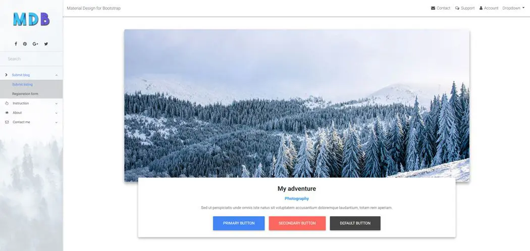
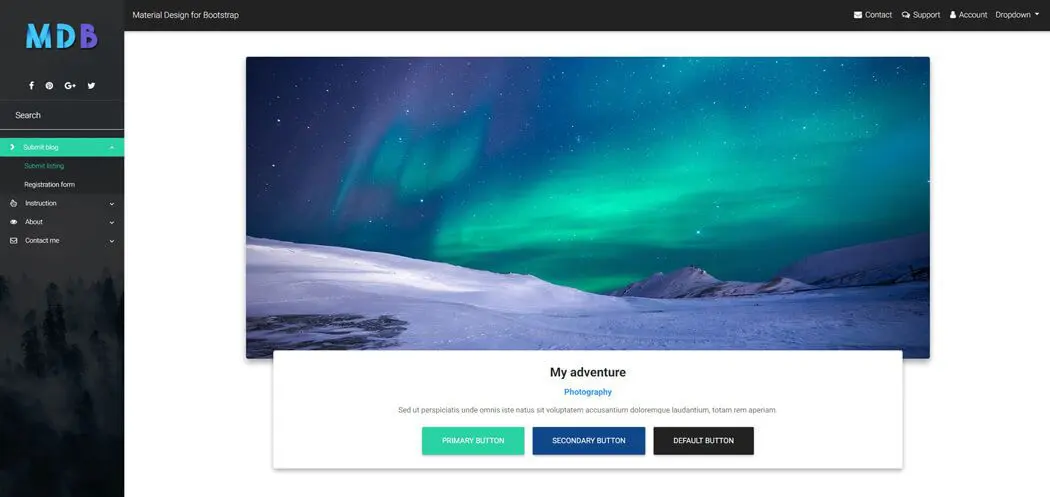
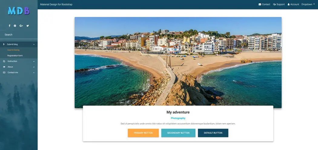
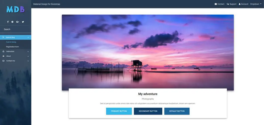
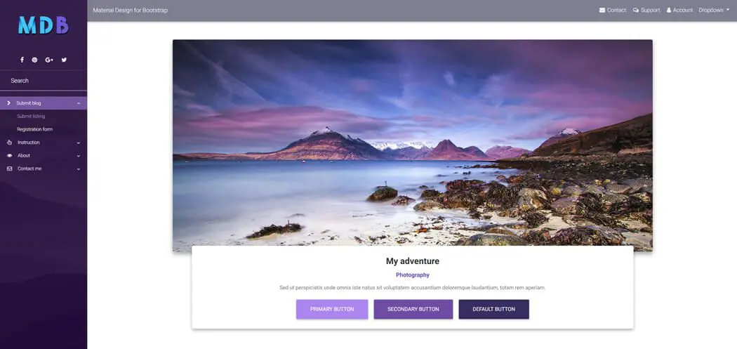
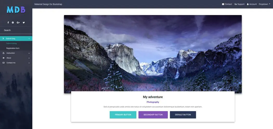
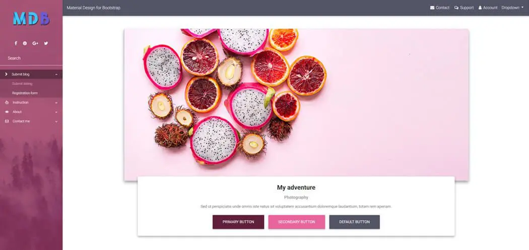
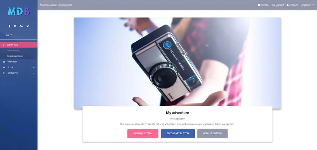
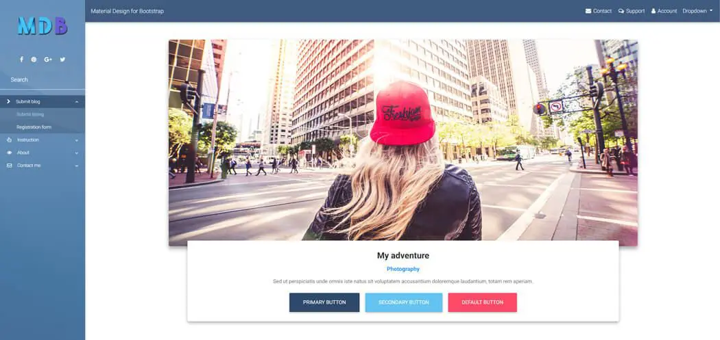
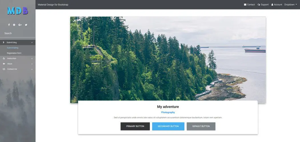
SideNav examples
Click on the images below to see live preview
React Bootstrap SideNav - API
In this section you will find advanced information about the SideNav component. You will find out which modules are required, what are the possibilities of configuring the component, and what events and methods you can use to work with it.
Imports
In order to use SideNav component make sure you have imported proper module first.
      import React from 'react'; import { MDBSideNav, MDBSideNavNav,
      MDBSideNavCat, MDBSideNavLink } from 'mdbreact';
API Reference: SideNavCat Properties
The table below shows the configuration options of the MDBSideNavCat component.
| Name | Type | Default | Description | Example |
|---|---|---|---|---|
className |
String | |
Sets custom classes |
<MDBSideNavCat className="customClass" />
|
disabled |
Boolean | false |
Disables element from being clicked |
<MDBSideNavCat disabled />
|
icon |
String | |
Adds font-awesome icon |
<MDBSideNavCat icon="caret-right" />
|
iconBrand |
Boolean | false |
Use this property to set brand icon (fab) |
<MDBSideNavCat icon="twitter" iconBrand />
|
iconClassName |
String | |
Adds custom classes to icon element |
<MDBSideNavCat icon="envelope" iconClassName="customClass"
              />
|
iconLight |
Boolean | false |
Use this property to set light icon (fal) |
<MDBSideNavCat icon="twitter" iconLight />
|
iconRegular |
Boolean | false |
Use this property to set regular icon (far) |
<MDBSideNavCat icon="twitter" iconRegular />
|
iconSize |
String | |
Sets icon size |
<MDBSideNavCat icon="pencil-alt" size="5x" />
|
id |
String | |
Sets element's id |
<MDBSideNavCat id="catOne" />
|
name |
String | |
Sets inner text |
<MDBSideNavCat name="Example name" />
|
tag |
String | li |
Changes default tag |
<MDBSideNavCat tag="li" />
|