Topic: Label Inconsistency
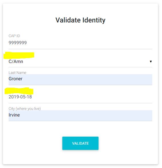
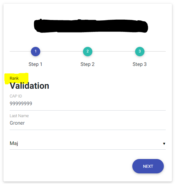
When using Labels that the labels show consistently. I am sure it is something I am not doing but perhaps someone can help me.
Resources (screenshots, code snippets etc.)
Code (I have tried this with <label>Rank</label> following the select and it does not work correctly either)
<mdb-input label="CAP ID" id="capid" group type="text" validate error="wrong" success="right"/>
<mdb-select label="Rank" color="primary" id="rank" v-model="ranks" validate error="wrong" success="right"/>
<mdb-input label="Last Name" id="lastname" group type="text" validate error="wrong" success="right"/>
<mdb-date-picker label="Date Joined CAP" id="datejoined" v-model="date" validate error="wrong" success="right"/>
<mdb-input label="City (where you live)" id="city" group type="text" validate error="wrong" success="right"/>

When I add the <label>Rank</label> option below the select it places the label way above everything.

cawgit
answered 7 years ago
Magdalena Dembna
staff premium answered 7 years ago
Hi, Thank you for drawing our attention to this issue, we will work on labels' display as soon as possible. Kind regards, Magdalena
Storism
answered 7 years ago
Is there any progress on this one?
The workaround does work but could do with a solid solution. Thanks
Magdalena Dembna staff premium commented 7 years ago
The task is still pending regarding different updates in our package. You can follow all major changes here: https://mdbootstrap.com/docs/vue/changelog/ .We are sorry for the inconvenience.
londoh
pro answered 7 years ago
This needs fixing urgently now please.
The workaround does kinda work and brings the label back into some sort of alignment, However label for select also has a different font size/weight, active color and background color than label for text input, and then the row/col applies unwanted padding.
I'm not a great UI expert at all (thats why I paid for MDBVue) but there seem to be many other inconsistencies in appearance of form components.
Here's another one for Select: It doesnt have Icon prop.
Please sort these things out.
Magdalena Dembna staff premium commented 7 years ago
I've added your suggestion about select icons to our idea board. As for padding and labels - we will try to fix it as soon as we can. Kind regards, Magdalena
londoh pro commented 7 years ago
thank you, I'll await updates
Magdalena Dembna staff premium commented 7 years ago
We'll try to include at least some of this changes in the next release.
FREE CONSULTATION
Hire our experts to build a dedicated project. We'll analyze your business requirements, for free.
Answered
- User: Free
- Premium support: No
- Technology: MDB Vue
- MDB Version: 5.2.0
- Device: Desktop
- Browser: Chrome
- OS: Windows 10
- Provided sample code: No
- Provided link: No