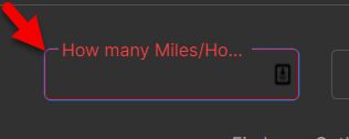
Topic: Removing the blue border from fields
chrspurser
premium asked 2 years ago
FYI - Not MDB - Tailwinds Elements. Form won't allow that value.
Expected behavior
being able to style these borders of active/focused fields. Hiding the goofy blue ring. :)
Actual behavior
borders of fields have BOTH our styles AND the browser blue border somehow.
Resources (screenshots, code snippets etc.)
You will see in the following screenshot, the blue border shown, which is undesirable.
Do you have advice for what to add/subtract from where? https://app.screencast.com/w0LWXfVTm9Y3G (<- backup only)

What I have tried:
- focus-visible:border-0
- focus-visible:none
- focus-visible:border-primary
- focus:ring-0
- focus-visible:ring-0
- ALL of those without "visible"
- border-transparent
- focus:border-transparent
- a host of other things I can't remember
here is my element code:
 <div class="mx-auto relative mb-8 sm:basis-1/3"
                         data-te-input-wrapper-init
                         @if($this->fieldIsRequired('unit_situations', 'odometer_hours'))
                            data-te-validate="input"
                            data-te-validation-ruleset="isNumber"
                            data-te-invalid-feedback="Must be a number."
                         @endif>
                        <input
                            wire:model="unit_situations__odometer_hours"
                            x-mask="9999999"
                            id="unit_situations__odometer_hours"
                            type="text"
                            class="peer block min-h-[auto] w-full rounded border-0 bg-transparent px-3 py-[0.32rem] leading-[1.6] focus-visible:ring-0 outline-none active:border-none transition-all duration-200 ease-linear focus:placeholder:opacity-100 peer-focus:text-primary data-[te-input-state-active]:placeholder:opacity-100 motion-reduce:transition-none dark:text-neutral-200 dark:placeholder:text-neutral-200 dark:peer-focus:text-bright [&:not([data-te-input-placeholder-active])]:placeholder:opacity-0"
                            placeholder="Default input"/>
                        <label
                            id="vertical_miles_label"
                            for="unit_situations__odometer_hours"
                            class="pointer-events-none absolute left-3 top-0 mb-0 max-w-[90%] origin-[0_0] truncate pt-[0.37rem] leading-[1.6] text-neutral-500 transition-all duration-200 ease-out peer-focus:-translate-y-[0.9rem] peer-focus:scale-[0.8] peer-focus:text-primary peer-data-[te-input-state-active]:-translate-y-[0.9rem] peer-data-[te-input-state-active]:scale-[0.8] motion-reduce:transition-none dark:text-neutral-200 dark:peer-focus:text-bright"
                        >How many Miles/Hours
                        </label>
                    </div>
Thank you
Bartosz Cylwik
staff answered 2 years ago
Hi! The blue border you are trying to change comes from the styling of our notches. You would have to use our class customization and change some of the classes.
You can check how our class customization works here:
https://tw-elements.com/docs/standard/getting-started/class-customization/
Classes for input can be found here:
https://tw-elements.com/docs/standard/forms/inputs/#api-section-classes
Example with notches color changed to danger - added border-danger and group-data-[twe-input-focused]:shadow-danger.
  <div class="relative mb-3" data-twe-input-wrapper-init
    data-twe-class-notch-leading-normal="border-secondary-500 dark:border-neutral-400 group-data-[twe-input-focused]:shadow-notch-1 group-data-[twe-input-focused]:shadow-danger group-data-[twe-input-focused]:border-danger"
    data-twe-class-notch-middle-normal="border-secondary-500 dark:border-neutral-400 group-data-[twe-input-focused]:shadow-notch-2 group-data-[twe-input-focused]:shadow-danger group-data-[twe-input-focused]:border-danger"
    data-twe-class-notch-trailing-normal="border-secondary-500 dark:border-neutral-400 group-data-[twe-input-focused]:shadow-notch-3 group-data-[twe-input-focused]:shadow-danger group-data-[twe-input-focused]:border-danger"
  >
FREE CONSULTATION
Hire our experts to build a dedicated project. We'll analyze your business requirements, for free.
Answered
- User: Free
- Premium support: No
- Technology: MDB Standard
- MDB Version: MDB5 7.2.0
- Device: PC
- Browser: Chrome
- OS: W10
- Provided sample code: No
- Provided link: Yes