Topic: Misaligned select element arrow
I upgraded from 6.1.0 to 6.4.0 and the arrow icons in all of my selects are now mis-aligned. This affects both normal selects and those embedded in other elements such as the datatables shown below. Why did this change and how can I get the arrows to align properly again?
Expected behavior
Down arrow of select element should be vertically aligned within select.

Actual behavior
Down arrow is mis-aligned and located too high in the element.

The full styles of the arrow itself are shown below:

Grzegorz Bujański
answered 3 years ago
RossK1
pro premium priority answered 2 years ago
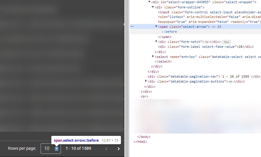
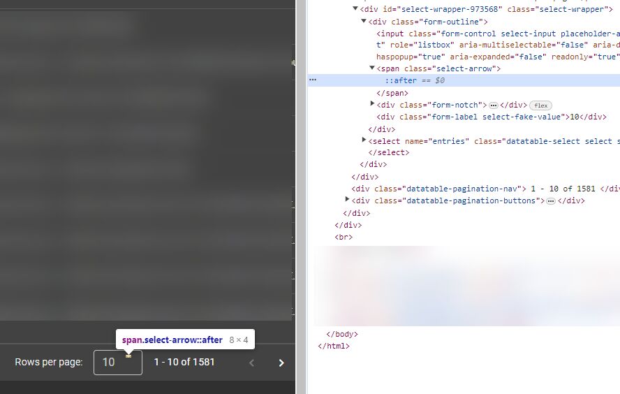
After a bit more research, it looks like this appeared when we upgraded from 6.1.0 to 6.4.1 (and the issue remains in 6.4.2). Without changing anything else in the code besides the mdb resources for css, js and snippets, the arrow changes from the first example below (6.1.0) to the second (6.4.2). Here I have it in a datatable to ensure that it's not related to how I'm implementing a select or anything like that. Any idea what is causing this? The only thing I notice is that in 6.1.0 it's setting the arrow to "before" but in 6.4.2 the arrow initializes as "after".


Kamila Pieńkowska staff commented 2 years ago
Do you have any custom CSS that can affect this arrow? The change that was made between those releases was changing this arrow from character to shape created with CSS. The arrow position is set with variable --mdb-form-outline-select-arrow-top: 7px;.
RossK1 pro premium priority commented 2 years ago
No, no custom CSS. I was unable to reproduce the issue in a snippet, but it is easy to do so in a small Django project. I have emailed the code to contact@mdbootstrap.com. Please check in with M.C. to get the attachment from that email or I can send it to a support email address.
Kamila Pieńkowska staff commented 2 years ago
Please send it to k.pienkowska@mdbootstrap.com
RossK1
pro premium priority answered 2 years ago
For anyone else finding this issue. Tech support confirmed that it is reproducible and appears to be related to how Django handles span heights.
By chance I have found that some combinations seem to work, e.g. the arrow is fine in Django v4.2.6 with MDB v7.0.0, but is again misplaced with Django v5.0.0 with MDB v7.1.0.
Regardless, the workaround from tech support was to override with the following css:
.select-arrow {--mdb-form-outline-select-arrow-top: 17px;}
FREE CONSULTATION
Hire our experts to build a dedicated project. We'll analyze your business requirements, for free.
Answered
- User: Pro
- Premium support: Yes
- Technology: MDB Standard
- MDB Version: MDB5 6.4.0
- Device: PC
- Browser: Chrome
- OS: Windows 10
- Provided sample code: No
- Provided link: No
RossK1 pro premium priority commented 3 years ago
I can center it manually with the below style, but ideally would like to find the cause of this issue rather than just band-aid patching it.
.select-arrow { top: 50% !important; transform: translateY(-50%); }