Topic: MegaMenu dropdown on small displays
Hi,
I'm working on header design for our ecommerce site. I'm stuck on visual problem when I want to use responsive classes on MegaMenu dropdown on small displays.
Expected behavior
I want MegaMenu dropdown behave like collapse on small diplay. I mean it should stretch parrent <li> so remaining items from parent menu get pushed down.
Actual behavior
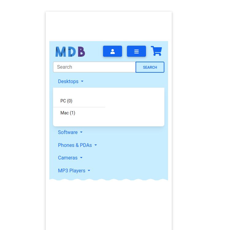
If I leave MegaMenu default style, than MegaMenu's dropdown is "floating" below dropdown-toggle and hiding parent menu items (img1.png).
When I change MegaMenu dropdown position to static:
#main-menu .dropdown-menu {<br> position: static;<br>}
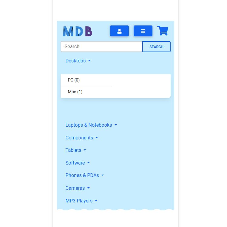
than the placement is right (parent menu is pushed down) but visual appereance is broken. Dropdown hase large empty space below it as shown on screenshot (img2.png). Firefox debuger is not much helpful - the space is not margin, not padding, it can't be even selected.
Resources (screenshots, code snippets etc.)
My snippet showing this behavior: https://mdbootstrap.com/snippets/standard/kolar/3187048


Grzegorz Bujański
answered 4 years ago
Try adding these styles:
#main-menu li.dropdown {
    display: contents;
}
FREE CONSULTATION
Hire our experts to build a dedicated project. We'll analyze your business requirements, for free.
Resolved
- User: Free
- Premium support: No
- Technology: MDB Standard
- MDB Version: MDB5 3.10.1
- Device: PC
- Browser: Firefox Developer Edition 99.0b5
- OS: Fedora 35
- Provided sample code: No
- Provided link: Yes