Topic: MDBDatePicker does not align horizontally with text Input
Larry White
asked 6 years ago
Expected behavior The datepicker should align vertically with an input text item. (Note I'm talking about the control and not the popup. )
Actual behavior It aligns differently. By itself, the datepicker is a beautiful control, but it doesn't fit well with the other controls.
Resources (screenshots, code snippets etc.)
Here is a screenshot.
 Note the pale grey underline beneath the text inputs is well below the (for some reason) dark line under the date picker.
The code for this is below. I also tried aligning the elements using a grid and it also failed, regardless of whether the individual cells were all set to vertically aligned at the top, middle, bottom, or baseline, the text items and the date picker were still not aligned.
Here is my code:
<MDBInputGroup
                                    material
                                    containerClassName="m-0"
                                    prepend="Plate 1"
                                    inputs={
                                        <>
                                            <MDBDatePicker
                                                format="DD-MMM-YYYY"
                                                getValue={this.getPickerValue}/>
                                            <MDBInput noTag type="text" hint="Type sth" />
                                            <MDBInput noTag type="text" hint="Type sth" />
                                        </>
                                    }
                                />
Piotr Glejzer
staff answered 6 years ago
Hi,
can you try to use this like that?
<MDBInputGroup
    material
    containerClassName='m-0'
    prepend='Plate 1'
    inputs={
      <>
        <MDBDatePicker
          format='DD-MMM-YYYY'
          getValue={this.getPickerValue}
          className='mb-0'
        />
        <MDBInput noTag type='text' hint='Type sth' />
        <MDBInput noTag type='text' hint='Type sth' />
      </>
    }
  />
Best regards,
Piotr
Larry White
answered 6 years ago
Now the line beneath the text is aligned, but the text itself is not. See attached image.

Also: This is a bug. Two controls that look as similar to each other as the text input and the datepicker should render aligned by default when they are in the same container. I shouldn't have to mess around with them to get basic functionality to work properly.
Piotr Glejzer staff commented 6 years ago
Yes, you are right. This is a little bug. There is a problem with class md-form from jquery. I will check this and try to fix as soon as possible. Sorry about that. Have a nice day
Larry White
answered 6 years ago
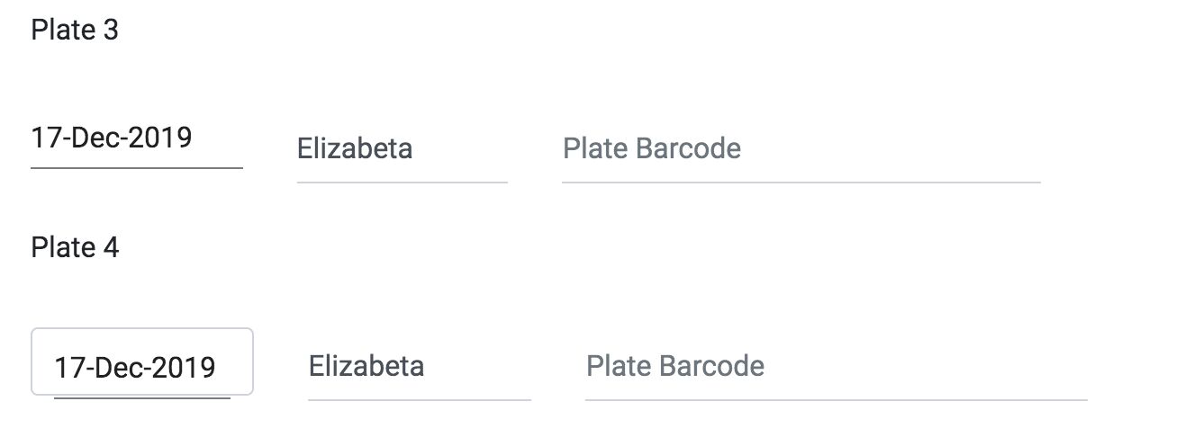
I should add to the comment above that I also tried this with the controls in a grid and adding 'mb-0' has no effect. See "plate 3" below.

On the other hand adding 'form-control' to the datepicker does make it align with the text boxes, (when they also have 'form-control' -- see "Plate 4"), but it also puts a border around the datepicker, but not around the text inputs. Again, if you apply the same class to two controls that look this similar, you should get the result. Either they should both have borders, or neither. Preferably neither in this case.
Here's the code for the grid approach:
                                <form>
                                <label>Plate 3</label>
                                <MDBRow>
                                    <MDBCol className="col-3">
                                        <MDBDatePicker
                                            className="mb-0"
                                            format="DD-MMM-YYYY"
                                            getValue={this.getPickerValue}/>
                                    </MDBCol>
                                    <MDBCol className="col-3">
                                        <MDBInput
                                            type="text"
                                            className="form-control"
                                            hint="Extraction Operator"
                                            value={this.state.exPlate3Operator.name}
                                            onChange={(e) => this.setState({exPlate3Operator: e.target.value})}/>
                                    </MDBCol>
                                    <MDBCol className="col-6">
                                        <MDBInput
                                            type="text"
                                            className="form-control"
                                            hint="Plate Barcode"
                                            value={this.state.explate3Barcode}
                                            onChange={(e) => this.setState({explate3Barcode: e.target.value})}/>
                                    </MDBCol>
                                </MDBRow>
                            </form>
                            <form>
                                <label>Plate 4</label>
                                <MDBRow>
                                    <MDBCol className="col-3">
                                        <MDBDatePicker
                                            className="form-control"
                                            format="DD-MMM-YYYY"
                                            getValue={this.getPickerValue}/>
                                    </MDBCol>
                                    <MDBCol className="col-3">
                                        <MDBInput
                                            type="text"
                                            className="form-control"
                                            hint="Extraction Operator"
                                            value={this.state.exPlate3Operator.name}
                                            onChange={(e) => this.setState({exPlate4Operator: e.target.value})}/>
                                    </MDBCol>
                                    <MDBCol className="col-6">
                                        <MDBInput
                                            type="text"
                                            className="form-control"
                                            hint="Plate Barcode"
                                            value={this.state.explate3Barcode}
                                            onChange={(e) => this.setState({explate4Barcode: e.target.value})}/>
                                    </MDBCol>
                                </MDBRow>
                            </form>
Larry White
answered 6 years ago
I hope not. That's not really a solution.
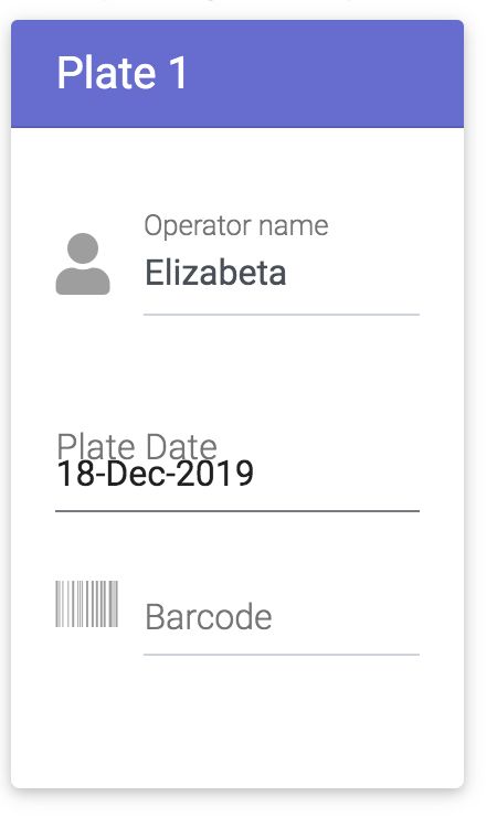
I gave up on trying to get the controls to align vertically and put them in a card instead. That also looks bad. The datepicker doesn't support icon apparently, and doesn't support label correctly. When you sell a collection of controls, they're supposed to work well together. This seems like something you just threw together so you could say you had a calendar control. For a "pro" component, this is disappointing to say the least.

        return (
        <MDBCard>
            <MDBCardHeader tag="h5" style={{
                'backgroundColor': '#666ad1',
                'color': 'white'
            }}>{this.state.plateName}</MDBCardHeader>
            <MDBCardBody>
                <form>
                    <div className="grey-text">
                        <MDBInput
                            label="Operator name"
                            icon="user"
                            group
                            value={this.state.operatorName}
                            type="text"
                            validate
                            error="wrong"
                            success="right"
                        />
                        <MDBDatePicker
                            label="Plate Date"
                            icon="calendar"
                            containerClass="text-left"
                            group
                            format="DD-MMM-YYYY"
                            getValue={this.getPickerValue}
                        />
                        <MDBInput
                            label="Barcode"
                            icon="barcode"
                            group
                            type="text"
                            value={this.state.plateBarcode}
                            validate
                            error="wrong"
                            success="right"
                        />
                    </div>
                </form>
            </MDBCardBody>
        </MDBCard>
    )
Piotr Glejzer staff commented 6 years ago
Datepicker is a plugin but we have our date picker but we will implement it in version 5.0.0. I added the task to your problems in our dashboard. If you find more feel free to make more posts, this will help to improve our package. Have a nice day.
FREE CONSULTATION
Hire our experts to build a dedicated project. We'll analyze your business requirements, for free.
Answered
- User: Free
- Premium support: No
- Technology: MDB React
- MDB Version: 4.22.1
- Device: any
- Browser: Chrome
- OS: any
- Provided sample code: No
- Provided link: No