Topic: MDB React toast color & icon
rashesh patel
asked 6 years ago
Hi, While using Notification Toast in React facing issues regarding Color & icon
Expected behavior
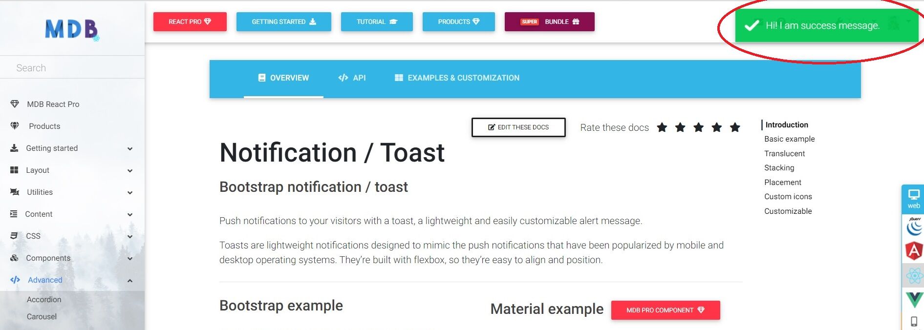
In MDB official Web app Notification Example we can see All toast color with some Tranceperancy and with the icon please find the image below

Actual behavior
Now Actually what I get using the same code is Color Difference and without the icon. Please find the image below.

Q-1)What should I do to get the same result as MDB react Example Notification Toast??
And
Q-2) Please tell me also how to Set the same toast in the center of that page???
Jakub Chmura
staff premium answered 6 years ago
hi @rashesh patel,
Q-1.
It's impossible to get the same result as an example because an example is written i jQuery. This component is different in react due to differences in technology.
I can add a task to figure out how to add these icons and some transparency to the notification component.
Q-2.
I've made you a snippet but remember to learn how to use any of the components in our documentation and read API. There you find answers to most of your questions. Searching solutions on your own will be much faster than waiting for our response.
import React from "react";
import { toast, ToastContainer, MDBContainer } from "mdbreact";

const NotificationPage = () => {
  const notify = type => {
    return () => {
      switch (type) {
        case "info":
          toast.info("Info message", {
            closeButton: false,
            position: "top-left"

          });
          break;
        case "success":
          toast.success("Success message", {
            position: "top-center"
          });
          break;
        case "warning":
          toast.warn("Warning message", {
            position: "bottom-center",
          });
          break;
        case "error":
          toast.error("Error message");
          break;
        default:
          toast.error("Error message");
      }
    };
  };

  return (
    <MDBContainer>
      <button className="btn btn-info" onClick={notify("info")}>
        Info
        </button>

      <button className="btn btn-success" onClick={notify("success")}>
        Success
        </button>

      <button className="btn btn-warning" onClick={notify("warning")}>
        Warning
        </button>

      <button className="btn btn-danger" onClick={notify("error")}>
        Error
        </button>
      <ToastContainer
        hideProgressBar={true}
        newestOnTop={true}
        autoClose={5000}
      />
    </MDBContainer>
  );
};

export default NotificationPage;
rashesh patel commented 6 years ago
Hi Jakub,
If this component is different in react due to differences in technology then why it is shown in react example?? Please Post the examples which we can get the same result.
Thank you.
Jakub Chmura staff premium commented 6 years ago
We're sorry about this situation, but all mdbootstrap site is written in jquery and we have a plan to change all jquery examples in react documentation to rendered react code.
Best, Kuba
saravane.rahulraj
answered 6 years ago
Hi Jakub,
I have tried the same example. I am not able to add an icon. Please let me know if we can add the icon for the toast component.
FREE CONSULTATION
Hire our experts to build a dedicated project. We'll analyze your business requirements, for free.
Answered
- User: Free
- Premium support: No
- Technology: MDB React
- MDB Version: 4.18.1
- Device: Laptop
- Browser: Chrome
- OS: Windows 10
- Provided sample code: No
- Provided link: No