Topic: Error $container-max-widths
"I can't load the container-max-widths: I have loaded from dist->mdb-ui-kit the sass folder into ./root/src/scss/scss/pro. It doesn't adjust to the designated maximum size."

My project is in vite not webpack
postcss.config.mjs import purgecss from '@fullhuman/postcss-purgecss'
const purgecssConfig = purgecss({ content: ['.//*.html', './node_modules/mdb-ui-kit/js/mdb.min.js'], css: ['./node-modules/mdb-ui-kit//*.css'] })
export default ({ env }) => ({ plugins: [env === 'production' ? purgecssConfig : false] })
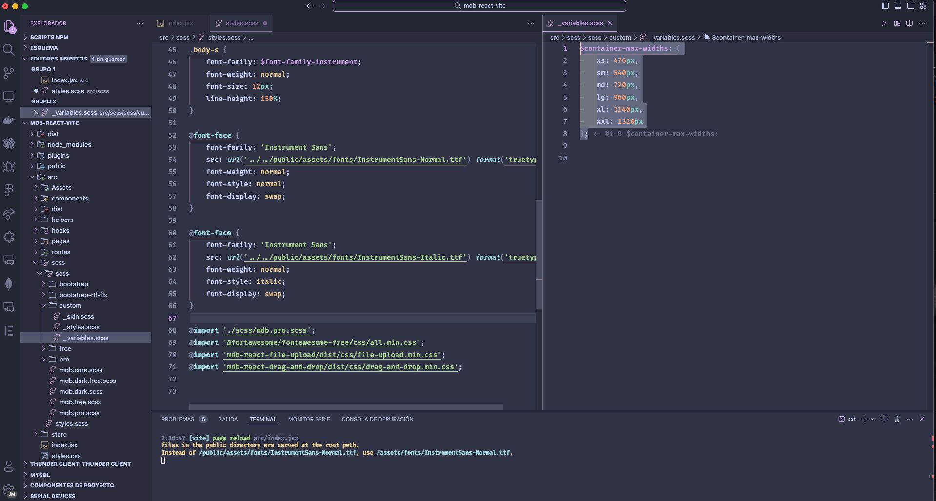
"Please close this as the issue was resolved. I copied the scss from node_modules/mdb-ui-kit/dist/{sass} into the src in my React project with Vite. I created an index.scss file to make an import of the CSS or SCSS I'll be using in the project. Then, in your index.js or index.jsx (whichever you use in your project), you should import that index.scss. In my case, I created a _variables.scss. It has to be named after any pro.mdb.scss you have, otherwise, you'll get a mixins error due to cascading failure.
Regarding the breakpoint error: The xs size isn't created as a class since from 0px to 520px you have a default max-width by default. In my case, I created in index.scss: $container-max-widths: ( sm: 476px );
_variables.scss: @include media-breakpoint-up(xs) { body { background-color: var(--light-grey, #fafafa); } .mb-sm { height: 100vh; } }
@include media-breakpoint-up(md) { .body-content-login { gap: 40; height: 476px; background-color: var(--li); border-radius: 40px; }
.header--logo {
    display: flex;
    justify-content: center;
}

.center-content-md {
    display: flex;
    flex-direction: column;
    justify-content: center;
    height: 100vh;
}
}
// @include media-breakpoint-up(lg) { // }
// @include media-breakpoint-up(xl) { // }
That was my solution. If anyone knows something simpler, this worked for me."
FREE CONSULTATION
Hire our experts to build a dedicated project. We'll analyze your business requirements, for free.
Resolved
- User: Pro
- Premium support: Yes
- Technology: MDB React
- MDB Version: MDB5 6.2.0
- Device: macos
- Browser: chrome
- OS: ventura 13.5
- Provided sample code: No
- Provided link: No
jmrg pro premium priority commented 3 years ago
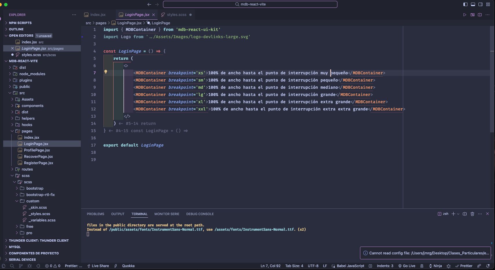
I add photo this project index.jsx and folders
jmrg pro premium priority commented 3 years ago
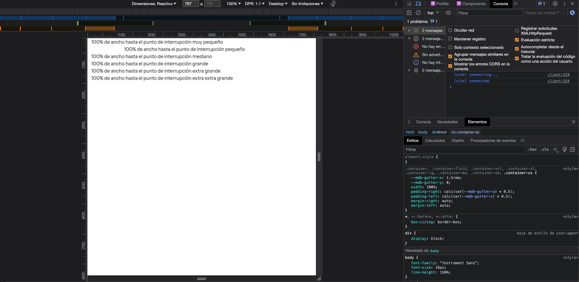
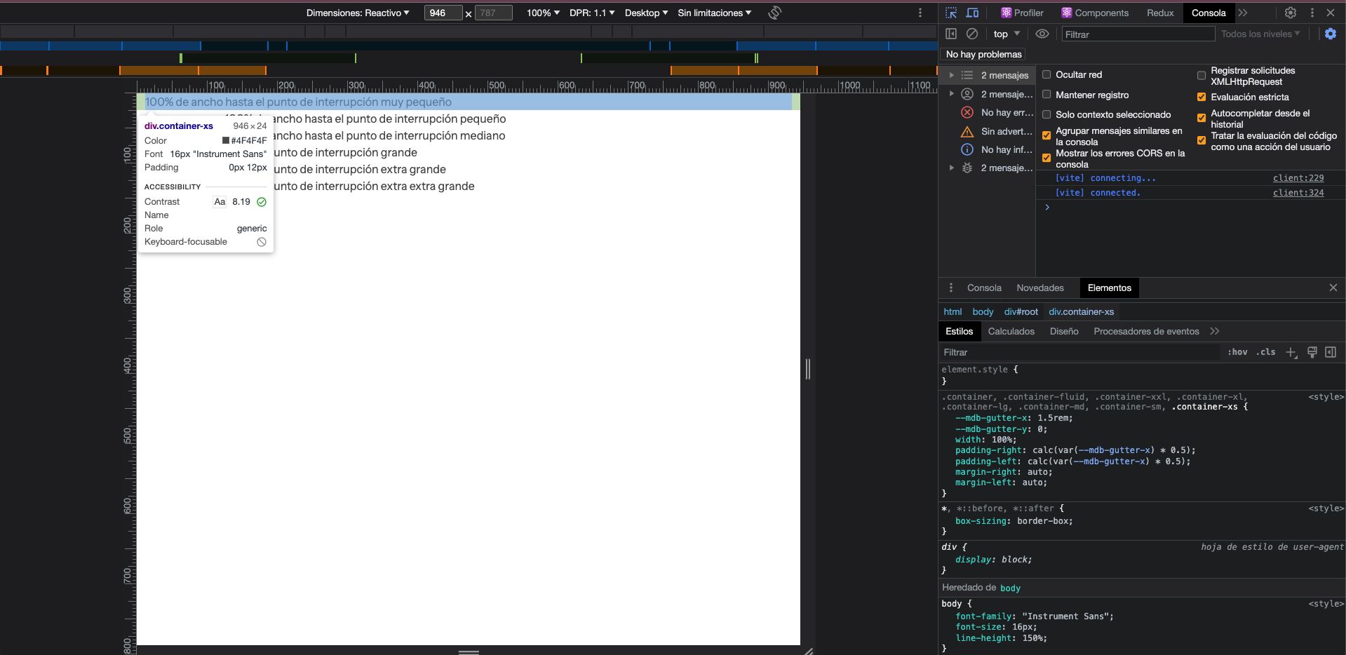
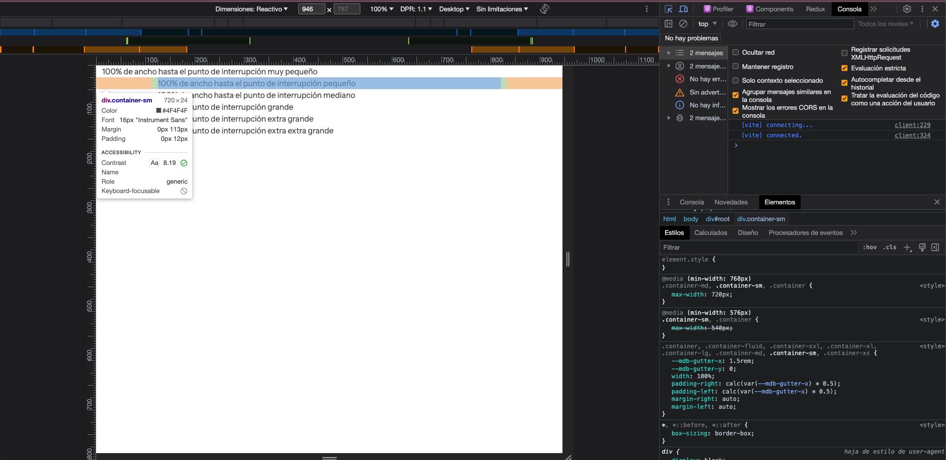
The size never goes below 520px in max-width even though I define xs as 476px.
mlazaru staff commented 3 years ago
That is weird, it worked for me. Can you show screenshot from the console to show the
max-widthvalues? Like this: