Topic: Responsive navbar. When expanded links hidden on some mobile devices screens

One some mobile screen sizes navbar works great and expands normally, but on some for example Pixel 2 phone screen navbar options hides and scrolling needed to see them. On iPhone 6/7/8 screens it works great and pop up normally. Please see screenshots. Thanks
Expected behavior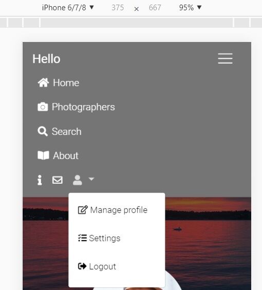 Actual behavior
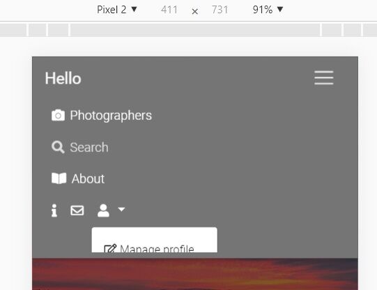 Resources (screenshots, code snippets etc.)
Need help to edit code so navbar works great on all screen sizes. Thank you !

Hi,
would you reproduce your problem by creating the snippet here: https://mdbootstrap.com/snippets/? I'll try to help you.
Best, Marta
FREE CONSULTATION
Hire our experts to build a dedicated project. We'll analyze your business requirements, for free.
Answered
- User: Free
- Premium support: No
- Technology: MDB jQuery
- MDB Version: 4.8.0
- Device: windows
- Browser: firefox
- OS: mobile
- Provided sample code: No
- Provided link: No