Topic: Problem with navbar dropdowns and sticky-top
Hello,
I have a problem with navbar dropdowns with a "sticky-top" and "fixed-top" navbar. In these cases, I have a scrollbar on the right when I clic on a dropdown after clicking on the hamburger menu.
It's the same problem in your example: https://mdbootstrap.com/snippets/jquery/mdbootstrap/102472
If you reduce the window width, clic on the hamburger menu, and on "dropdown", the dropdown menu is hidden and you need to scroll to see it.
Thanks,
Jerome Ouvrard
Marta Szymanska
answered 7 years ago
Hi,
this is a normal behavior of dropdown because dropdown is fixed. How would you like to dropdown behave?
Best, Marta
COTIGA
answered 7 years ago
HIHave the same problem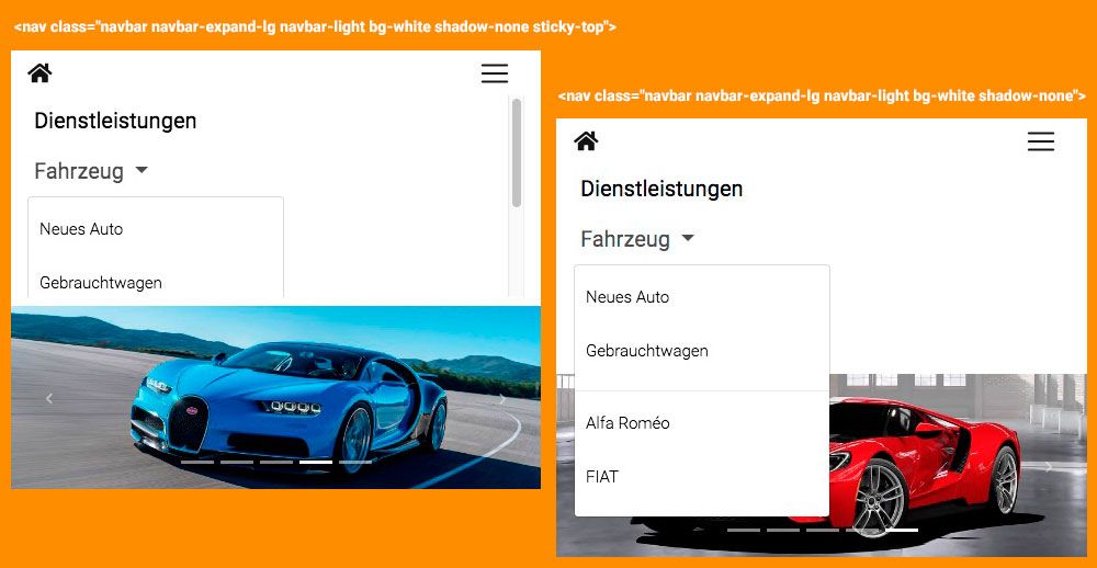
To regain normal bootstrap behavior
@media (max-width: 991px) {
    .navbar .dropdown-menu {
        position: static !important;
    }
}
@media (max-width: 767px) and (min-width: 400px), (max-width: 850px) and (min-width: 800px) {
    .navbar.fixed-top .navbar-collapse, .navbar.sticky-top .navbar-collapse {
        /* max-height: 340px; */
        max-height: initial;
    }
}
Marta Szymanska
answered 7 years ago
Hi,
in our documentation here: https://mdbootstrap.com/snippets/jquery/mdbootstrap/102472 there is no hidden scrollable dropdown. Which version of MDB do you have @COTIGA? Would you paste here a link to your demo? We will inspect the problem and try to fix this as soon as possible.
Best, Marta
COTIGA
answered 7 years ago
Hi Marta,
Thank you for your interest in the problem
In your example, if I activate Dropdown and resize the page under 1222px, I have the same problem. Starting from 1223px, it is correct
There are several resolutions where the bug appears and / or disappears
Marta Szymanska commented 7 years ago
Hi,
OK, now I understand the issue. We will fix that as soon as possible.
Best, Marta
poomkawin
answered 7 years ago
Hi,
I have the same issue with the dropdown menu on the navbar. The dropdown is working fine on desktop and small phone. However, when it comes to larger phone or tablet, the dropdown is hidden inside the navbar. I have to scroll the navbar to see the contents of the dropdown.
On desktop, the dropdown is working as expect.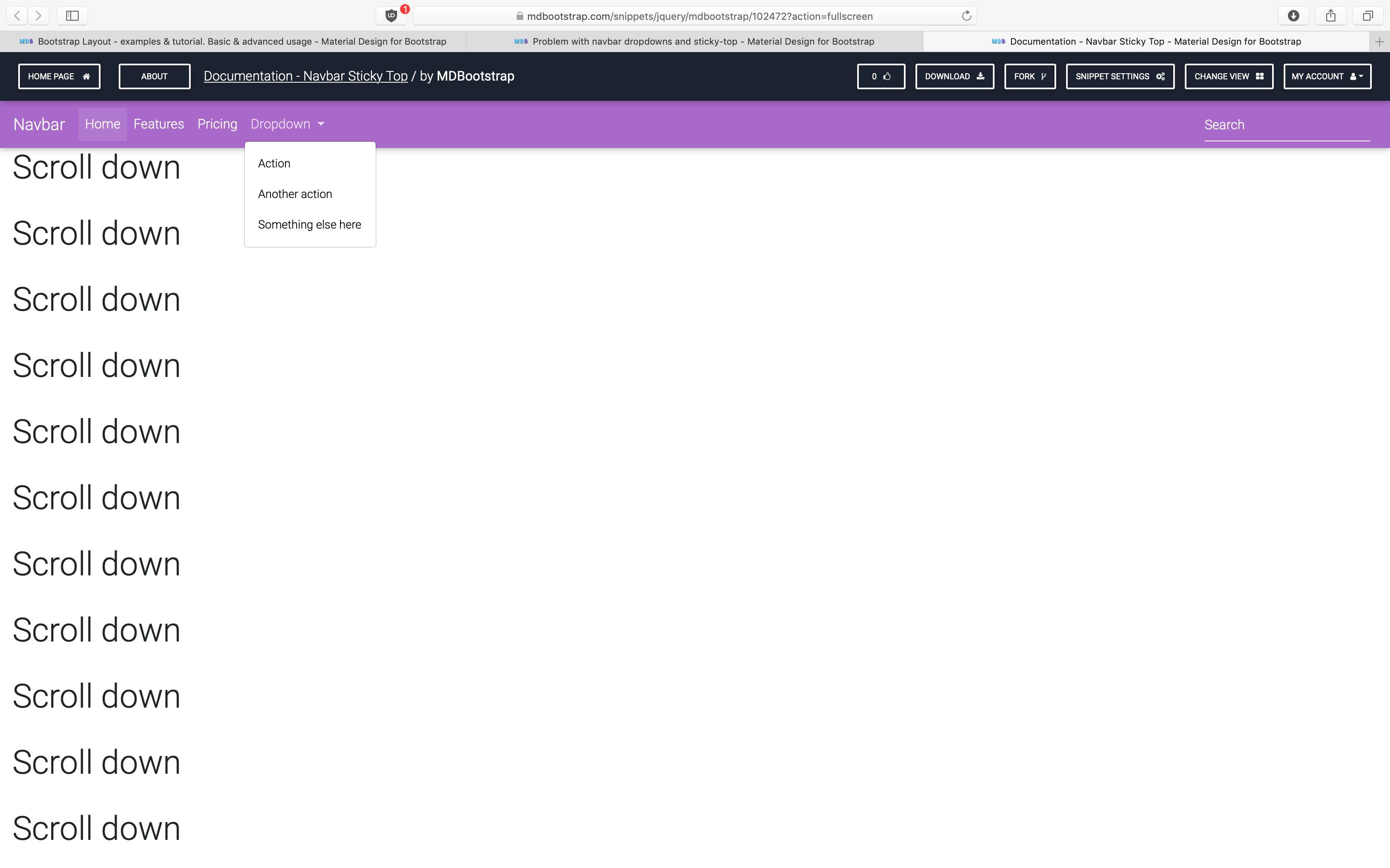
The dropdown is also working as expect on small phone.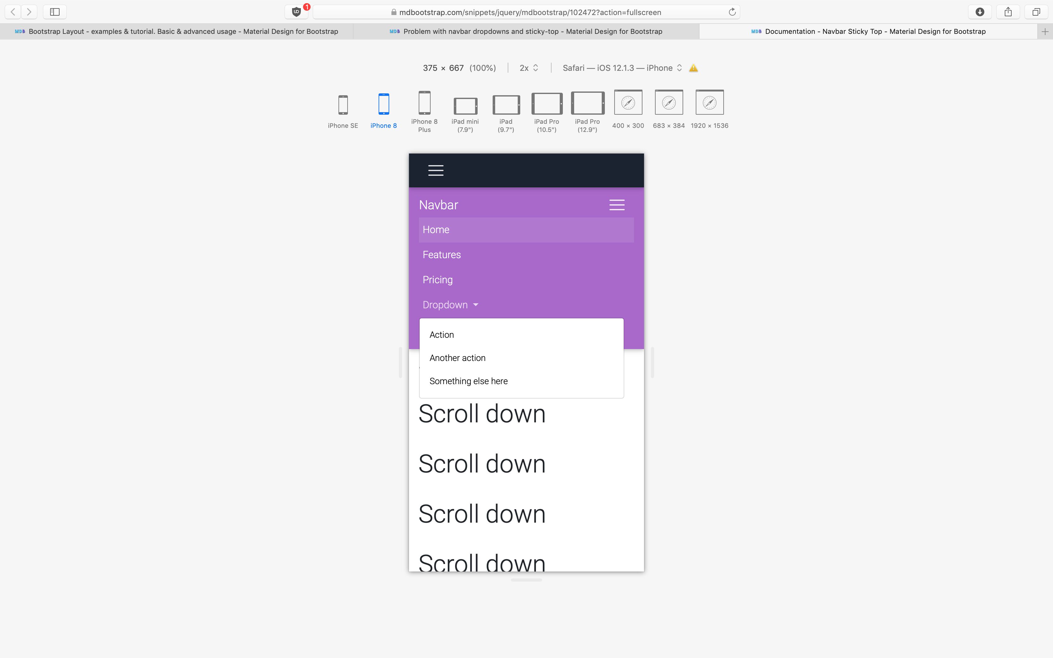
However, the dropdown menu is hidden inside the navbar on large phone and tablet.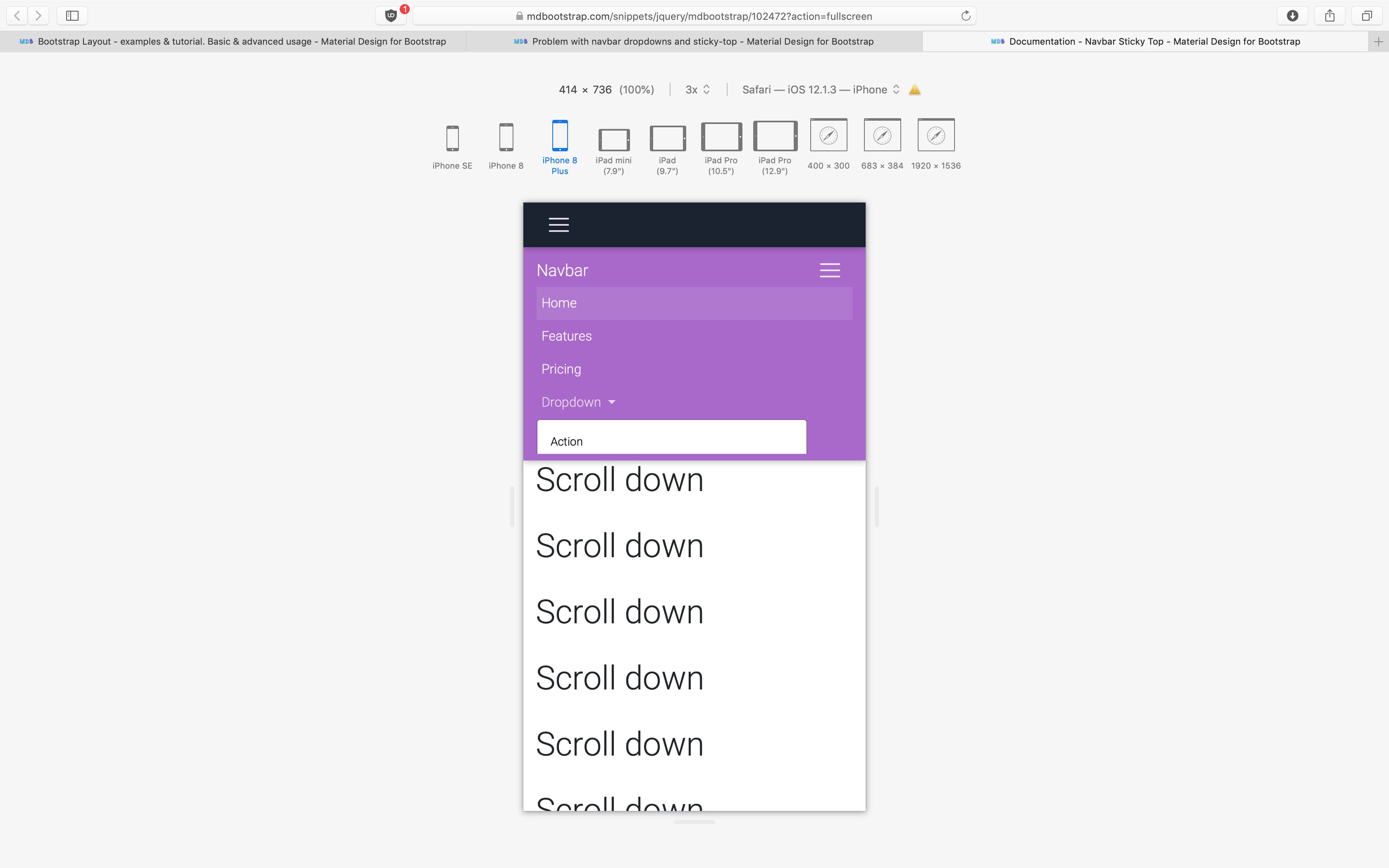
Need to scroll the navbar to see the contents.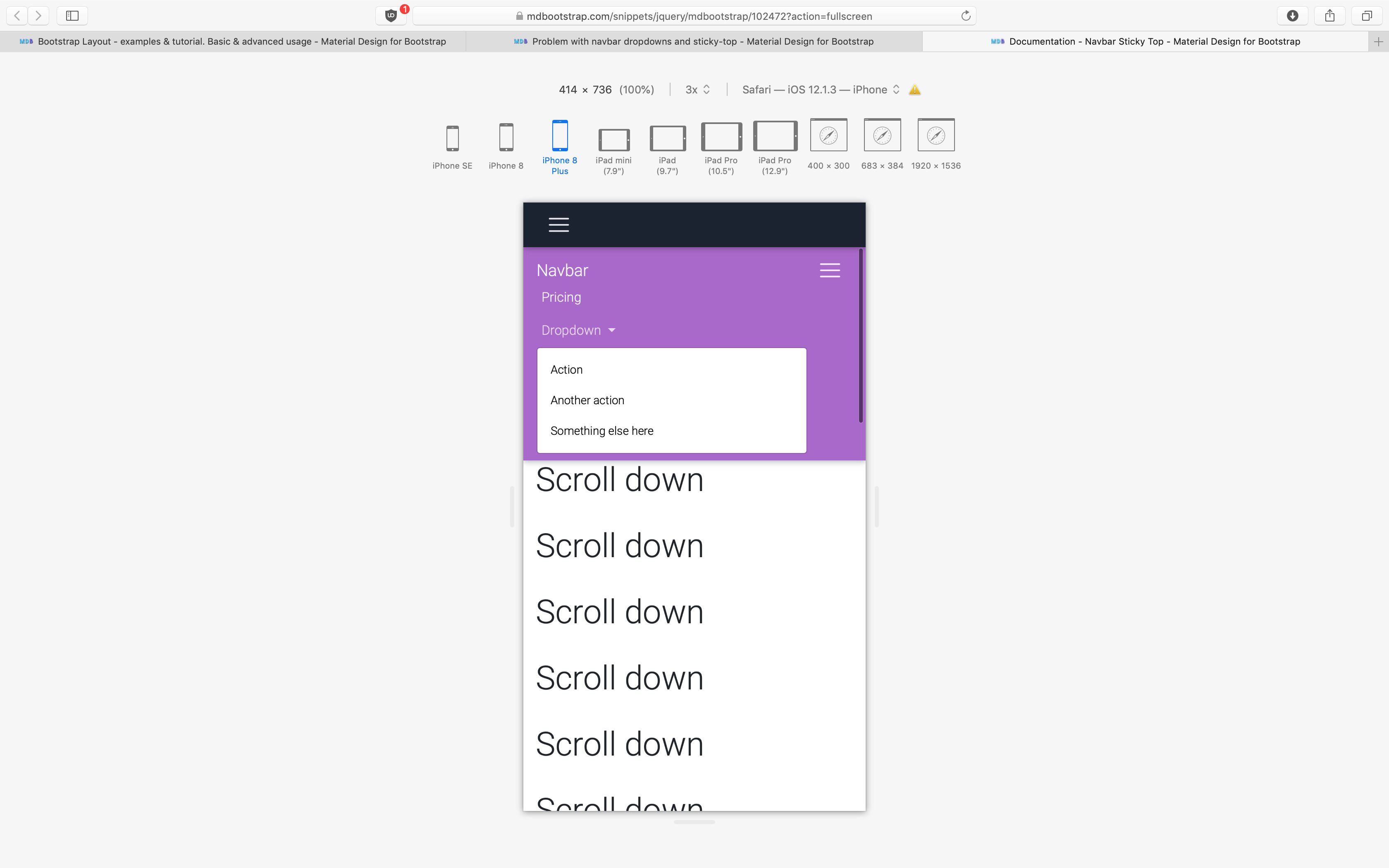
Is there any method is fix this issue without falling back to the normal Bootstrap behaviours?
Marta Szymanska
answered 7 years ago
Hi,
would you paste here a link to your snippet? Because in mine here: https://mdbootstrap.com/snippets/jquery/marta-szymanska/1106168?view=project I don't see this problem.
Best, Marta
poomkawin
answered 7 years ago
Hi Marta,
The issue also exists in one of your examples.https://mdbootstrap.com/snippets/jquery/mdbootstrap/102472 On desktop and small mobile device, the dropdown is working fine.However, on tablet (10.5" iPad Pro in portrait orientation) and larger mobile device (on a plus-size iPhone) the dropdown is hidden inside the navbar, as the screenshots I posted earlier.
Marta Szymanska commented 7 years ago
Hi,
this solution was needed tor fixed and sticky navbar because when you have more content in the navbar and the navbar is fixed to the top, you can't scroll down and see a collapsed dropdown.
Best, Marta
Marta Szymanska commented 7 years ago
But we will fix this in the nearest release which will be on Monday 02.09.
poomkawin
answered 7 years ago
Hi Marta,
I just got a chance to test the new version of the MDB (4.8.9).The dropdown is working as expected now.Thank you for the fix.
FREE CONSULTATION
Hire our experts to build a dedicated project. We'll analyze your business requirements, for free.
Answered
- User: Pro
- Premium support: No
- Technology: MDB jQuery
- MDB Version: 4.8.5
- Device: All
- Browser: All
- OS: Windows
- Provided sample code: No
- Provided link: Yes