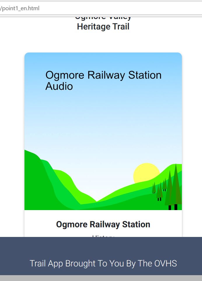
Topic: Make space under audio player
Expected behavior I expect to see the bottom of the card and the player button
Actual behavior I can not see the play button on android, it is hidden and not showing due to the length of the section.
Could you tell me what I need to do to increase the margin or space at the bottom of your bootsnipp player here please?
Resources (screenshots, code snippets etc.) http://www.bridgendreach.org.uk/app/point1_en.html
Krzysztof Wilk
staff answered 7 years ago
Hello!
Can you describe your device and put your code in our snippets? Because everything on my device and in developers tools in browser works fine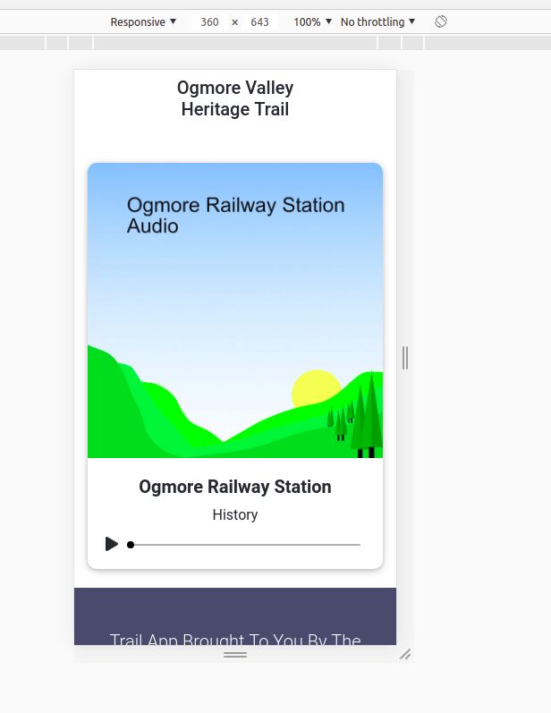
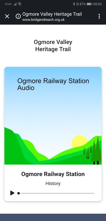
I think you should define sizes of grid elements on smaller devices, but I might be wrong.
asmiles
answered 7 years ago
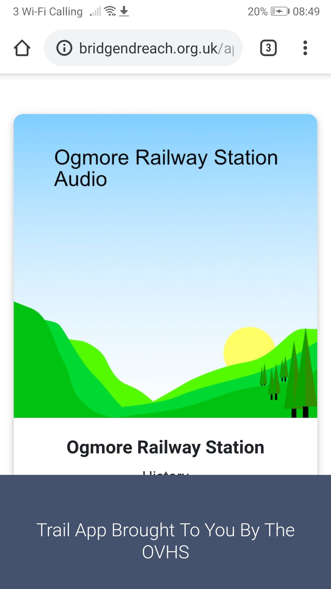
I am using an Honor 9 mobile device
This is what I am seeing and as you can see the play button as well as the bottom of the card is not showing. It shows on my wifes Honor 10 phone so it's rather strange!
Snippet is here:
https://mdbootstrap.com/snippets/jquery/asmiles/915462?action=forum_snippet
asmiles
answered 7 years ago
Krzysztof Wilk
staff answered 7 years ago
Oh, now I see. You made some mistakes in bootstrap grid. For example you have too much tags, one div has no open tag, in other place there is a tag, were there is no opening tag. Your script and CSS looks very cool and I think you should rewrite your HTML code. Alternatively you can exchange your footer on, for example, modal, which you can close, so It won't be covering your playing panel. Anyway - this behavior on various devices is seriously weird, because I've got Huawei phone too (Huawei P20 Pro), your wife has Honor 10 and the player looks good, It is starting to looks bad on devices with equal or below 1080x1920 resolution :D but I think my resolution above should help and It'll start to display properly on every device
asmiles
answered 7 years ago
I am not a coder... So most of what you say i lost on me to be honest. I have taken all the code from MD Bootstrap and inserted it into the html.
I have attached an image showing an issue in MS Edge where there appears to be a white area after adding a margin-top: 200px; to the footer. If you could give me the lines where I need to make the adjustment in the html regarding your last answer that would be really helpful.
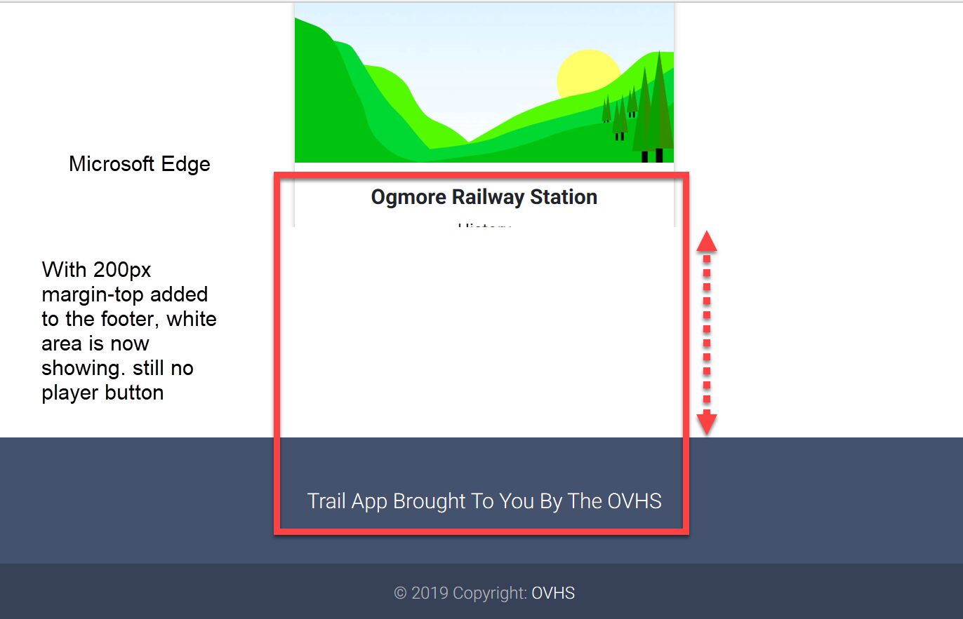
asmiles
answered 7 years ago
I just wanted to add that regardless of mobile devices there is still an issue on Microsoft Edge browser
Krzysztof Wilk
staff answered 7 years ago
Now I can't even scroll your snippet on mobile devices ;( Can you change it like it was before? Try to add .mt-5 class to your footer or .mt-5 class to your last div element or even both at once. Copying code is not all, you have to understand bootstrap grid, so I recommend you to read about it in our documentation:
https://mdbootstrap.com/docs/jquery/layout/grid-usage/
You are not a coder, but you're doing well, so I think you can do it with a little bit knowledge :D
FREE CONSULTATION
Hire our experts to build a dedicated project. We'll analyze your business requirements, for free.
Answered
- User: Free
- Premium support: No
- Technology: MDB jQuery
- MDB Version: 4.8.5
- Device: Android
- Browser: Chrome
- OS: Windows
- Provided sample code: No
- Provided link: Yes
