Topic: I have a problem with a double navigation where viewport responsiveness is breaking, what is wrong?
marioolofsson
asked 5 years ago
Expected behavior I have made a WordPress Theme out off my mdbootstrap 4.19.1 jquery version and have everything working as it should and thought my double navigation should be responsive.
Actual behavior The problem is that my navbar (I think) is pushing the hole page wider then viewport so that I am able to scroll sideways on my cellphone, getting the same problem on my test station as well..
Resources (screenshots, code snippets etc.)
Screenshot 1: https://paste.pics/48d397be239c910f41816e040dcc10d3 Screenshot 2: https://paste.pics/9e13d89564c7c4d6b5f5de3d3dfd757e
Link to online WordPress Website: https://wordpressmu-374242-1541747.cloudwaysapps.com/en/
All plugins deactivated , No caching or any other enhancements active
Marcin Luczak
staff answered 5 years ago
Hi,
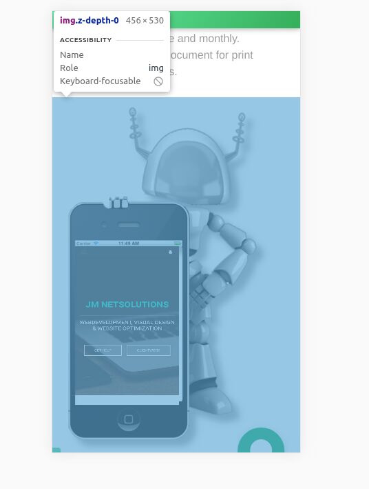
I've checked your website and everything is fine with the navbar. Its normal behavior is to take 100% width of the page. Element on your website causing horizontal scroll for mobile devices is the image below. For a mobile device with 360px width, the natural width of the image is 456px.

Changing its wrapper div element style to max-width: 100% and the image to have width of the wrapper, e.g also with max-width: 100% or any other image sizing style seems to be fixing your problem.
Best regards, Marcin
marioolofsson commented 5 years ago
Thanks, such a follish mistake! Tired from a 26 hour codesprint to finish a clientjob. Never a good idea to try wrapping my own project when deadly tired.. Now it works! :)
FREE CONSULTATION
Hire our experts to build a dedicated project. We'll analyze your business requirements, for free.
Resolved
- User: Free
- Premium support: No
- Technology: MDB jQuery
- MDB Version: 4.19.1
- Device: Samsung S10e
- Browser: All
- OS: Android
- Provided sample code: No
- Provided link: Yes