Topic: fixed-action-btn on the left
Andrew Ford
pro premium priority asked 6 years ago
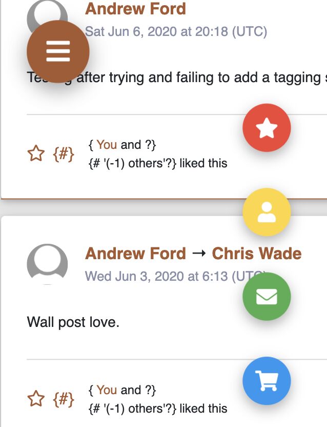
Expected behavior: I copy the snippet from the documentation, then change the style="right: 24px;" part of the attribute to style="left: 24px;" (I still have the bottom: 45px;) thinking it will be at the bottom left, and the "menu" slide up.
Actual behavior: The trigger button is closer to the top of the page, and the "menu" slides down and are aligned in the center of the page.
Resources (screenshots, code snippets etc.):

Andrew Ford
pro premium priority answered 6 years ago
The following seems to work, the button is now at the very bottom, well 45px from the bottom anyway.
Just have to add the classes: d-flex and align-self-end to .fixed-action-btn.
<div class="fixed-action-btn d-flex align-self-end" style="bottom: 45px; left: 24px; right: unset;">
<a class="btn-floating btn-lg btn-orange"> <i class="fas fa-bars"></i> </a>
<ul class="list-unstyled">
  <li>
    <a class="btn-floating red"><i class="fas fa-star"></i></a>
  </li>
  <li>
    <a class="btn-floating yellow darken-1"><i class="fas fa-user"></i></a>
  </li>
  <li>
    <a class="btn-floating green"><i class="fas fa-envelope"></i></a>
  </li>
  <li>
    <a class="btn-floating blue"><i class="fas fa-shopping-cart"></i></a>
  </li>
</ul>
https://mdbootstrap.com/snippets/jquery/andrew_ford/2177015
Grzegorz Bujański commented 6 years ago
Hi. did this solve the problem completely?
Andrew Ford pro premium priority commented 6 years ago
It seemed to. I edited the post to include a link to the 'mdbfiddle' I created.
Grzegorz Bujański commented 6 years ago
Thanks for that. Everything looks good. It looks like you did it :)
FREE CONSULTATION
Hire our experts to build a dedicated project. We'll analyze your business requirements, for free.
Answered
- User: Pro
- Premium support: Yes
- Technology: MDB jQuery
- MDB Version: 4.19.0
- Device: N/A
- Browser: N/A
- OS: N/A
- Provided sample code: No
- Provided link: No
Andrew Ford pro premium priority commented 6 years ago
I see others have had issues, I added
right: unset;to the style attribute and that fixed the "menu" alignment. The only problem I am having is the trigger button not in the bottom-left corner.