Topic: CSS files between pro and standard produce different outcomes
Hi, for a while we were using the css at https://mdbootstrap.com/wp-content/themes/mdbootstrap4/css/compiled-4.5.15.min.css?ver=4.5.15
I realise thats not suggested practice, but it seemed to be fine for a long time.
I have just replaced it with the PRO mdb.css 4.5.15, but now weird stuff happens where before the design was fine.
For example, with 4.5.15 PRO Css file, all btn-floating btn-small buttons are now square.
If i paste the sample round button code from your website, 4.5.15 gives me square buttons, but switching back to the compiled.min.css off your site, everything is fine.
how can this be the case? why are the outcomes so different?!
Wood
pro answered 7 years ago
I have just double checked, everything looks fine with MDB Pro 4.5.10, but everything is messed up in 4.5.15.
Round buttons (btn-floating) showing as square etc.
PLEASE FIX.
Marta Szymanska
answered 7 years ago
Hi,
I'm not sure what you mean because I don't see any problem with our buttons. I created a snippet with rounded and floating buttons. Please, point out where is the problem: https://mdbootstrap.com/snippets/jquery/marta-szymanska/156005. You can also create your own snippet here: https://mdbootstrap.com/snippets/ with your code and show me an issue. I'll try to solve this.
Best,
Marta
Wood
pro answered 7 years ago
ok, ive tried, but every time I attempt to save it, it errors (Failed to load resource: the server responded with a status of 413 (Payload Too Large)), but I can reproduce it.
in html i put:
<a class="btn-floating btn-lg purple-gradient"><i class="fa fa-bolt"></i></a>
<a class="btn-floating peach-gradient"><i class="fa fa-leaf"></i></a>
<a class="btn-floating btn-sm blue-gradient"><i class="fa fa-star"></i></a>
in CSS i copied in Bootstrap v4.1.3 CSS. As soon as bootstrap is added, 2 of the buttons go square.
i presume I need bootstrap.css, because without bootstrap included, everything in my project is just a garbled mess.
so, why are the buttons going square, its like bootstrap is superceding mdb.
Marta Szymanska
answered 7 years ago
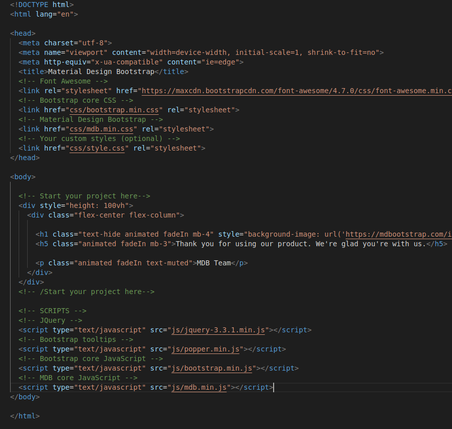
I still don't know why you have this effect because as you can see in my snippet, everything looks fine. Do you use MDB 4.5.10 version or 4.5.15 now? How does your files structure look? Is this like on the screenshot below?

Best,
Marta
Wood
pro answered 7 years ago
ok thanks for clarifying, i think its a source order issue. that needs to be far more prevalent in the documentation, there is no distinction about order of sources at all.
Marta Szymanska
answered 7 years ago
Hi,
here, in this tutorial: https://mdbootstrap.com/education/bootstrap/quick-start/ you can learn how to arrange links in HTML page in MDB package.
Best,
Marta
Wood
pro answered 7 years ago
yeah, would be good if you added some details to this bit:
<!-- Bootstrap core CSS *** MUST BE FIRST *** -->
    <link href="css/bootstrap.min.css" rel="stylesheet">
    <!-- Material Design Bootstrap *** MUST COME SECOND***  -->
    <link href="css/mdb.min.css" rel="stylesheet">
    <!-- Your custom styles (optional) -->
    <link href="css/style.css" rel="stylesheet">
to exclusively note the fact that bootstrap must be first and mdb must be second in order. we integrated this into an existing project, we didnt copy paste your code, so its not particularly obvious.
Marta Szymanska
answered 7 years ago
FREE CONSULTATION
Hire our experts to build a dedicated project. We'll analyze your business requirements, for free.
Answered
- User: Pro
- Premium support: No
- Technology: MDB jQuery
- MDB Version: 4.5.10
- Device: desktop
- Browser: chrome
- OS: win10
- Provided sample code: No
- Provided link: No