Topic: Cards and Panels Responsiveness
Oreofe S Adeyemi
asked 5 years ago
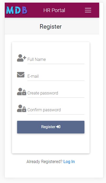
I am a student and i am doing a project where I used cards and panels but they are creating extra space on small devices display such that the navbar is having extra space by the right side of the screen. When I removed the cards and panels, the navbar itself is responsive and there is no extra space on the right.
Actual behavior
Resources (screenshots, code snippets etc.)
FREE CONSULTATION
Hire our experts to build a dedicated project. We'll analyze your business requirements, for free.
Open
- User: Free
- Premium support: No
- Technology: General Bootstrap questions
- MDB Version: -
- Device: Desktop computer
- Browser: chrome
- OS: windows 10 pro
- Provided sample code: No
- Provided link: No
Marcin Luczak staff commented 5 years ago
Hi,
Could you please create a snippet https://mdbootstrap.com/snippets/ with your code? This will help me better understand your issue and propose a solution.
Keep coding, Marcin
Oreofe S Adeyemi commented 5 years ago
Hello Marcin, I have created and published my code Snippet as you requested. Thanks for your support
Marcin Luczak staff commented 5 years ago
Please paste the link to your snippet here
Oreofe S Adeyemi commented 5 years ago
This is the link to my snippet https://mdbootstrap.com/snippets/jquery/oreofe_s_adeyemi/3169165
Marcin Luczak staff commented 5 years ago
Your snippet is not reachable, it might be set to private. Please set your snippet to public or publish it.