Topic: Leaving an icon nav visible when sidenav to collapse horizontally
Hello,
I need to create a Double Navigation with fixed SideNav & fixed Navbar
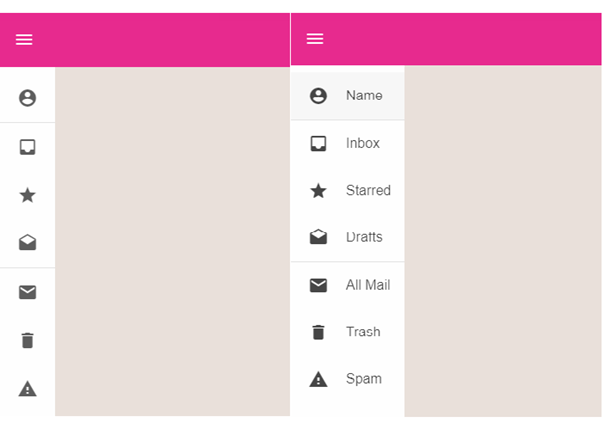
The SideNav must show the option icons only.
The burger menu must always be shown on the NavBar
When the burger menu is clicked, the sidenav shows the option name ; if the burger menu is clicked again, the sidenav hides the option name and only the icon is shown. If the screen dimention is “md”, the SideNav has to hide automatically.
Un example is shown in the snapshot: Mini-Variant Drawer

How could I create such a layout using your components (mdb-navbar and mdb-side-nav) ?
Damian Gemza
staff answered 7 years ago
Dear @Frederic
Please take a look at a Slim Sidenav feature, which we have added with latest (7.5.2) release.
If something will be unclear, feel free to ask!
Best Regards,
Damian
Frederic
pro premium priority answered 7 years ago
Dear @Damian,
Thank you very much, Slim Sidenav works well !!!
I still have two questions:
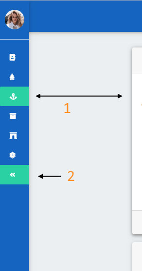
when the Sidenav is Slim, the distance between the Slim Sidenav and the "content of the main" remains 15rem. Is it possible to reduce it (to 4rem for example) ?
When the "minimize" option is cliched, the option remains active. Is it possible that the option does not stay active?

Thank you
Frederic
pro premium priority answered 7 years ago
Here is also the code of Slim Sidenav :
<mdb-navbar-brand>
  <!-- Logo -->
  <li>
    <div class="logo-wrapper sn-ad-avatar-wrapper">
      <a href="#">
        <img src="https://mdbootstrap.com/img/Photos/Avatars/img%20(10).jpg"
             class="rounded-circle"><span>Anna Deynah</span>
      </a>
    </div>
  </li>
  <!--/. Logo -->
</mdb-navbar-brand>

<links>
  <!-- Side navigation links -->
  <li>
    <ul class="collapsible collapsible-accordion">
      <mdb-accordion [multiple]="false" aria-multiselectable="false">

        <!-- Simple link -->
        <mdb-accordion-item *ngFor="let option of menu" class="no-collase">
          <mdb-accordion-item-head routerLink="{{ option.routerLink }}" routerLinkActive='active' mdbWavesEffect>
            <i class="{{ option.icon }}"></i><span class="ml-1">{{ option.text}}</span>
          </mdb-accordion-item-head>
          <mdb-accordion-item-body></mdb-accordion-item-body>
        </mdb-accordion-item>

        <mdb-accordion-item class="no-collase">
          <mdb-accordion-item-head mdbWavesEffect (click)="sidenav.toggleSlim()">
            <i class="fas fa-angle-double-left"></i> Minimize
          </mdb-accordion-item-head>
          <mdb-accordion-item-body></mdb-accordion-item-body>
        </mdb-accordion-item>

      </mdb-accordion>
    </ul>
  </li>
  <!--/. Side navigation links -->
</links>
<div class="sidenav-bg mask-strong"></div>
Thank you.
Damian Gemza
staff answered 7 years ago
Dear @Frederic
Let me answer your questions in the order in which you have asked them:
1) You have to change this space manually with css, 2) There's no possibility. Those links are marked as active with class .active, so you have to remove the .active class from every link after switching to the slim version.
Best Regards,
Damian
FREE CONSULTATION
Hire our experts to build a dedicated project. We'll analyze your business requirements, for free.
Answered
- User: Pro
- Premium support: Yes
- Technology: MDB Angular
- MDB Version: 7.5.1
- Device: Computer and SmartPhone
- Browser: Edge and Chrome
- OS: Windows 10
- Provided sample code: No
- Provided link: Yes